Created in 2006, Netmessage is a cloud-based solution, leader in the e-messaging industry. In 2014, in order to modernize an aging technological park and to face an increased competition, the company launched the project to completely redesign its software.
The new Netmessage platform had to be faster, more modern, cleaner and easier to use.
Considering the complexity of the project and as the SMS channel represented 80% of the revenue, it is on this medium that the development efforts were first focused on.
Role
User research
Wireframing
Content design (texts, call to actions, error messages…)
Duration
2 years Part time
(2014-2016)
Collaborators
CTO
Lead Developer
Head of Customer Support
Research Phase
In order to create a simplified version of the campaign software, we first conducted a competitive benchmark. Since 2008, editors of messaging solutions had multiplied on the market. To identify the trends back in the days, our comparative research focused on younger companies such as Digitaleo or Sarbacane Software.
Then, we analyzed the clients requests concerning the use of the platform that were sent to customer support. Customer calls were also studied in order to identify which types of complaints were most often reported.
Finally, our attention focused more specifically on what was happening during the training sessions on the platform and the questions asked about the functionalities. By studying those questions and various pain points during these interviews, we were able to identify areas for improvement.
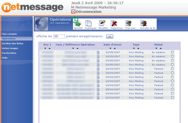
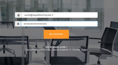
screen “Log in”
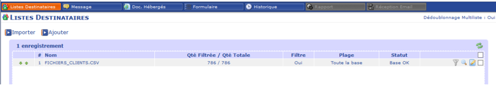
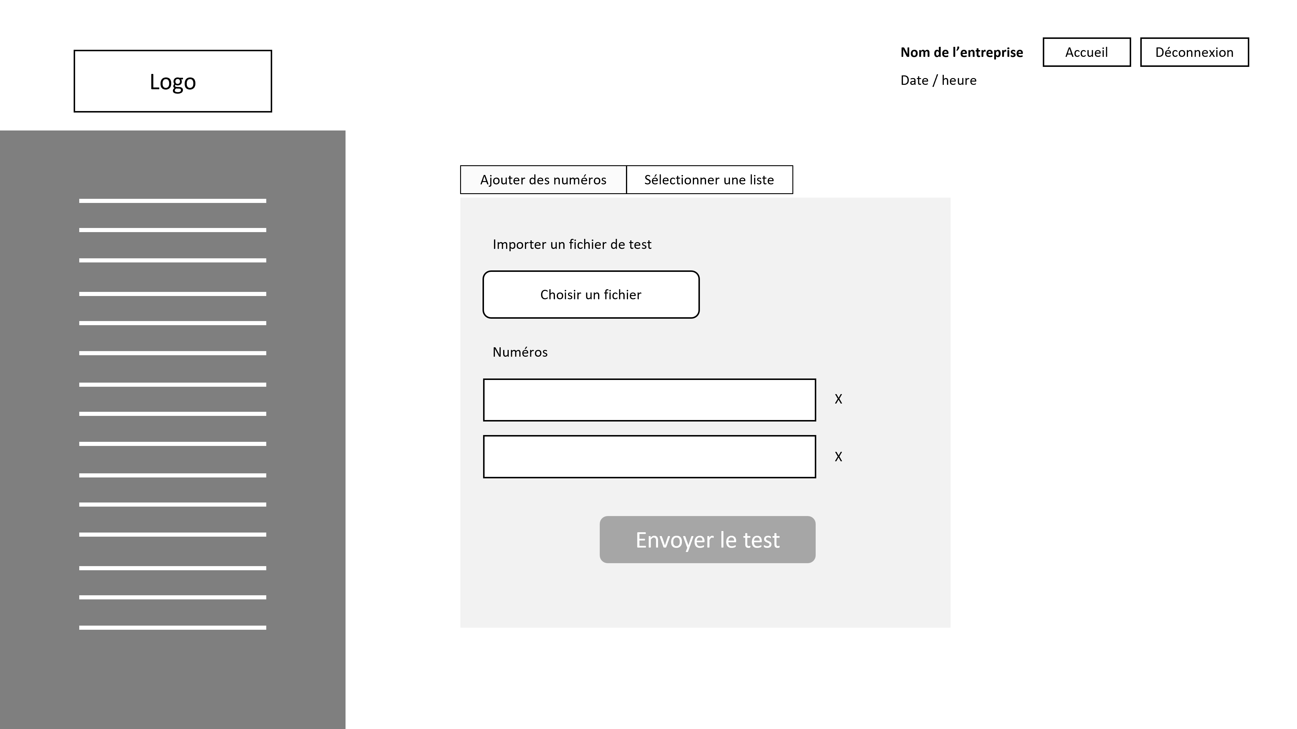
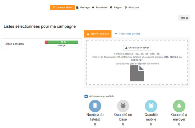
screen ” import / add a list of recipient numbers”
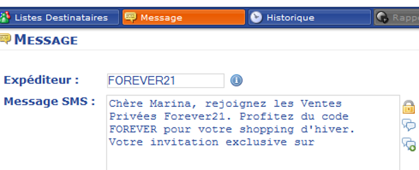
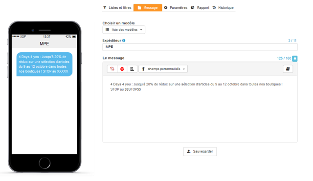
screen ” writing the SMS “
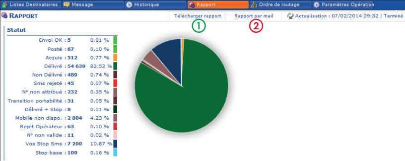
screen ” broadcast report”
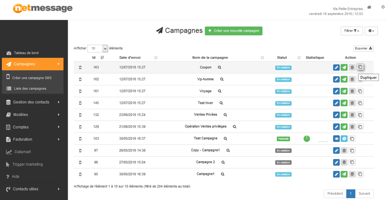
screen ” list of campaigns”
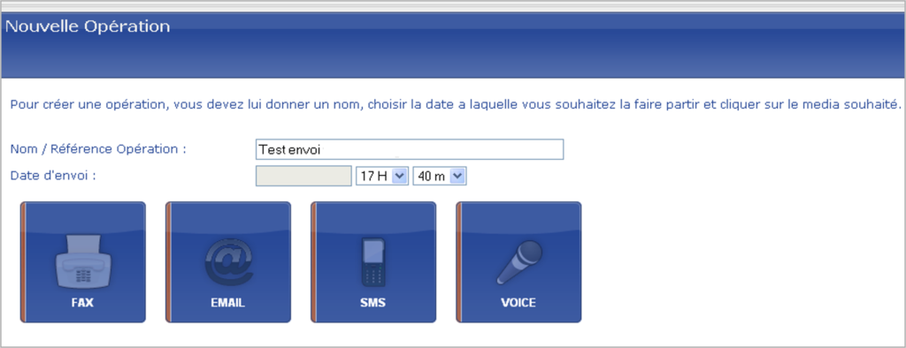
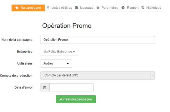
screen “creating a new sms campaign”
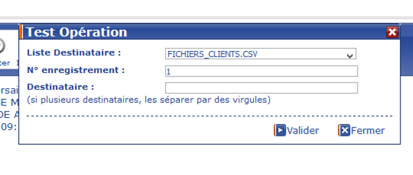
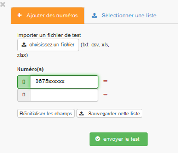
screen ” testing the campaign”
Key findings
Users don’t like the design very much
Users don’t always achieve their goal and have to call customer support for help
The email editor is very complicated to use
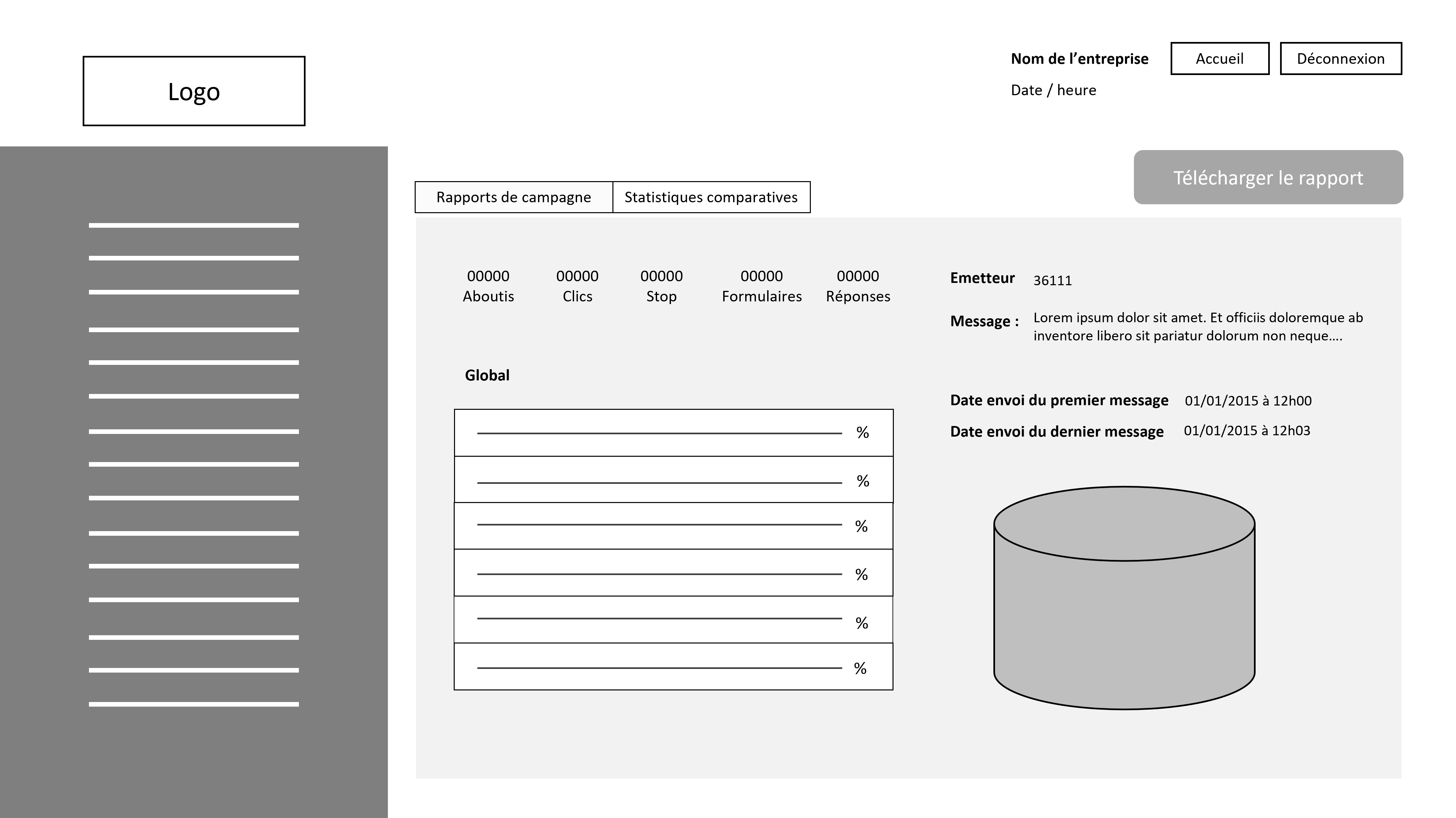
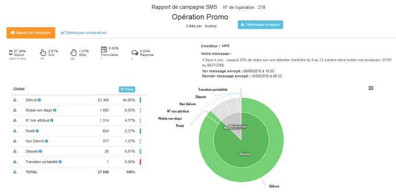
Campaign delivery statistics are difficult to understand
The vocabulary used is sometimes too technical
Users do not have global visibility on their campaigns
Design phase | Modeling the main screens
Thanks to the data collected during the research phase, I sketched layout models and worked on writing a new verbatim to improve the navigation on the platform. In collaboration with the developers, I participated in the development follow-up and the optimization of the functionalities.
The user journey to create an SMS campaign is as follows:
Connection to the web platform
Access to the list of campaigns
Creation of a new SMS campaign
Adding the list of recipient numbers (mobile)
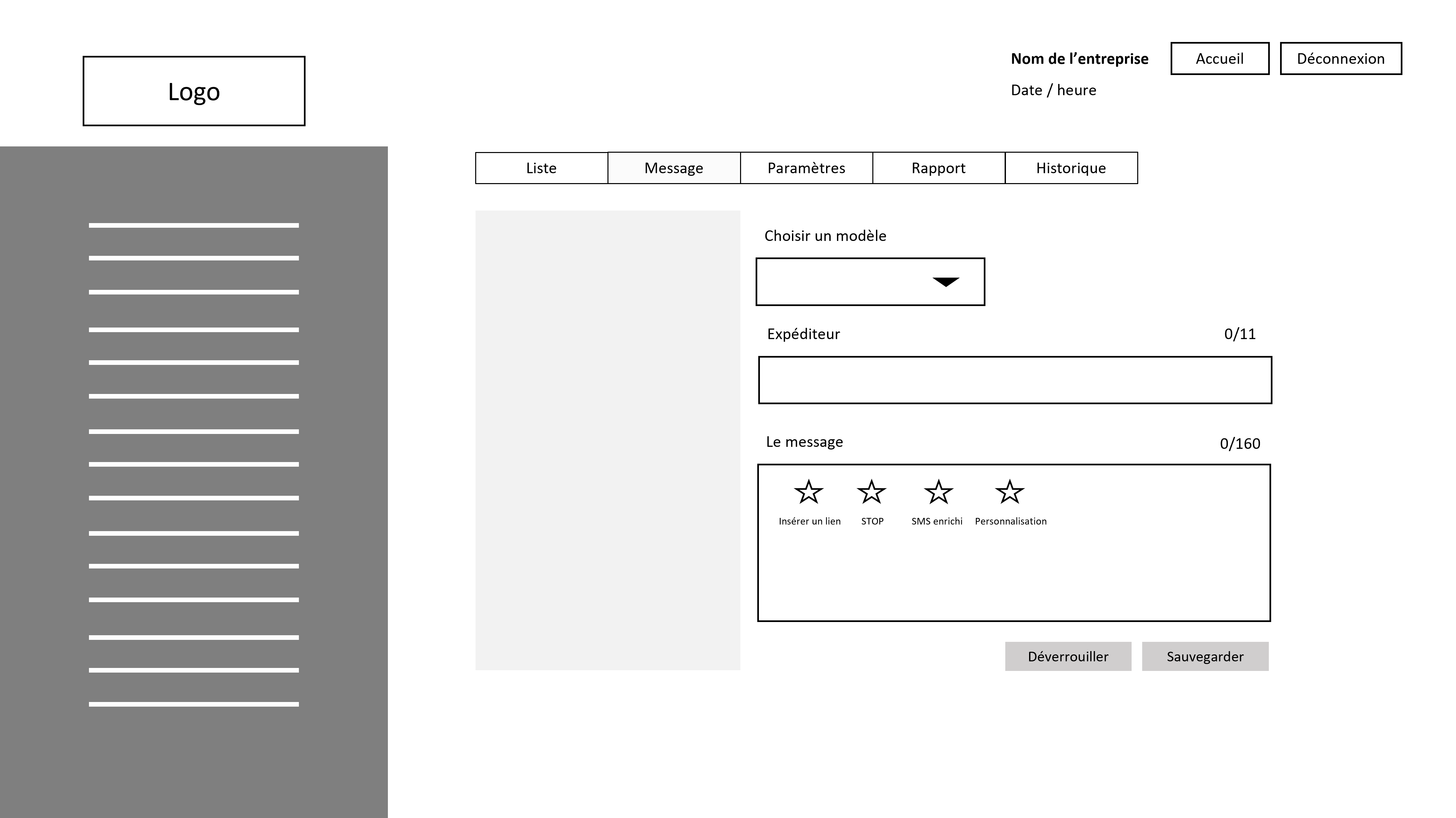
Writing the message
Testing
Programming / Launching the campaign
So I captured these steps in the following mockups:
Screen “log in”
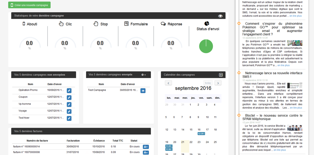
Screen “dashboard”
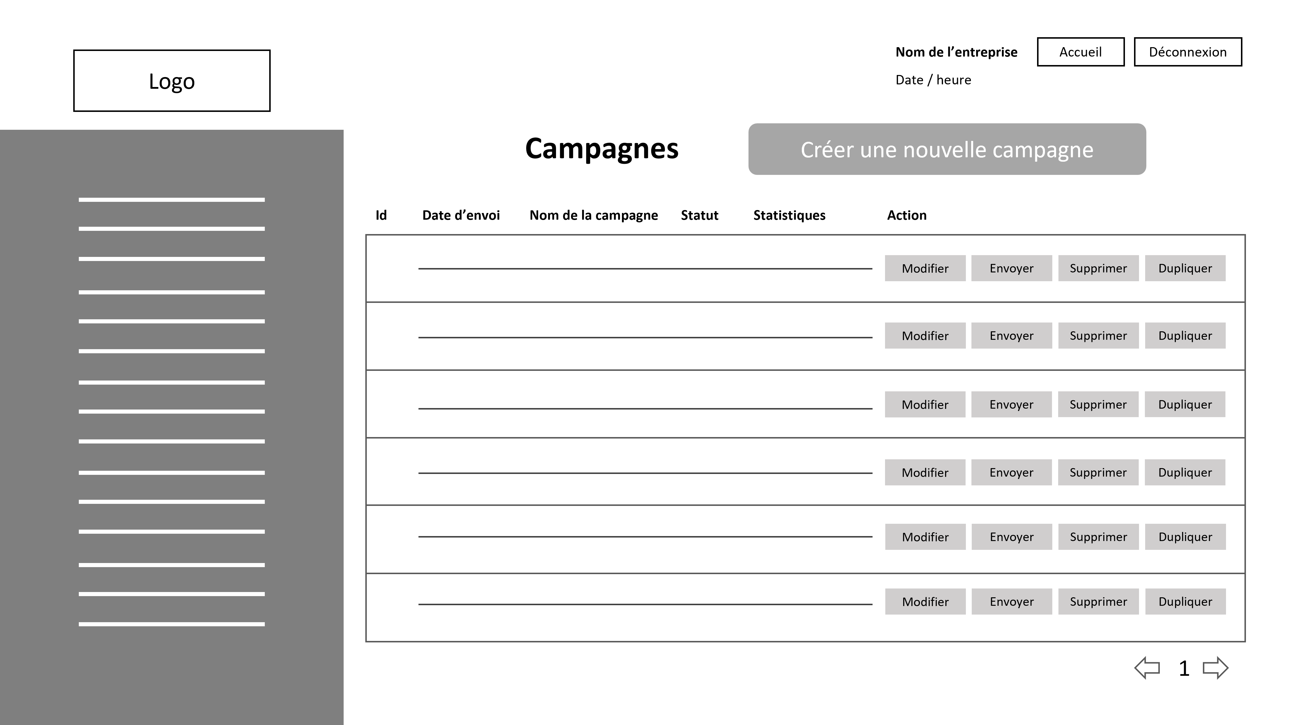
screen ” list of campaigns”
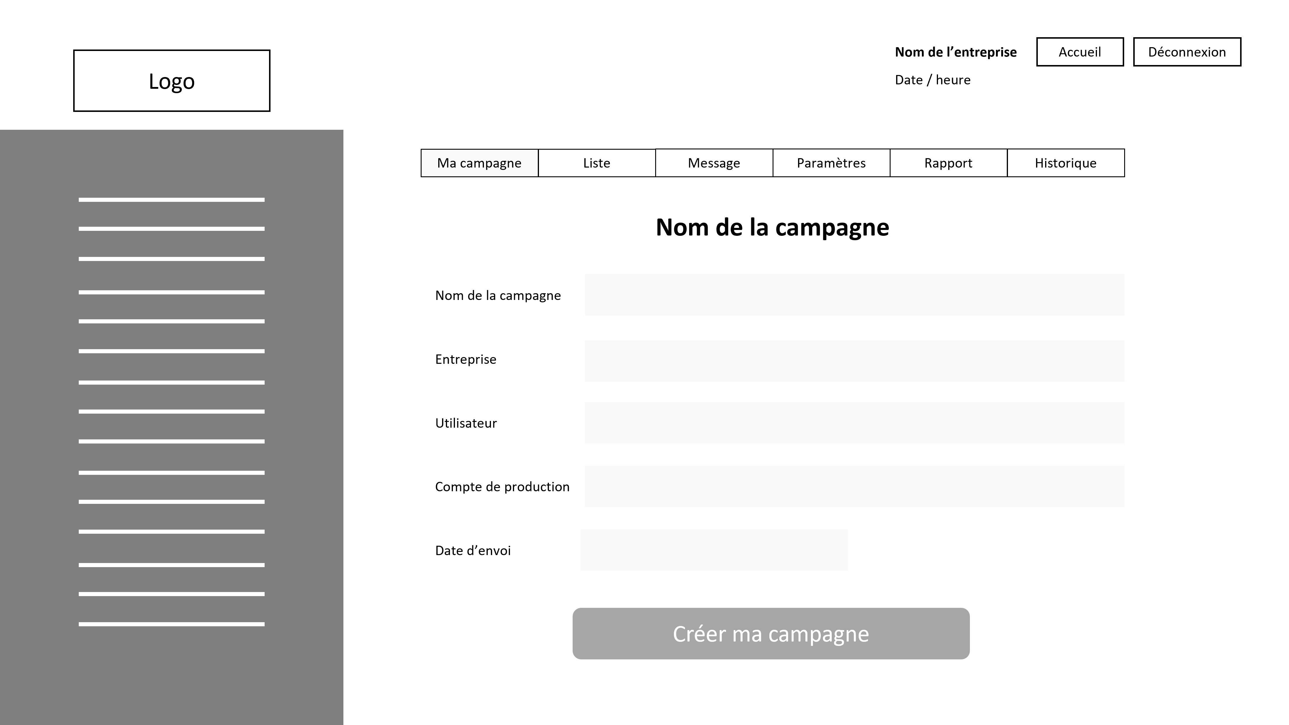
screen “creating a new sms campaign”
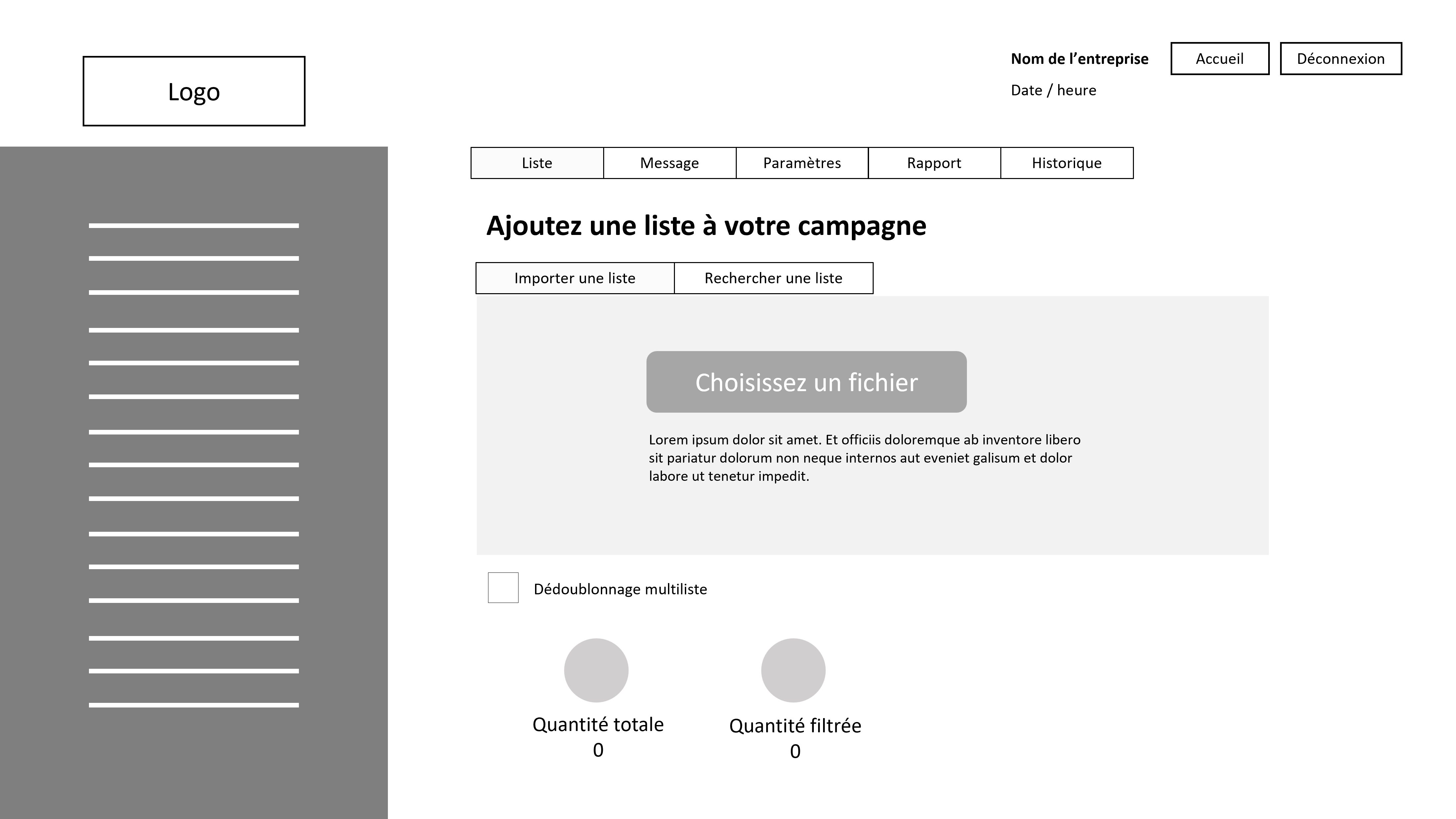
screen ” import / add a list of recipient numbers”
screen ” writing the SMS “
screen ” testing the campaign”
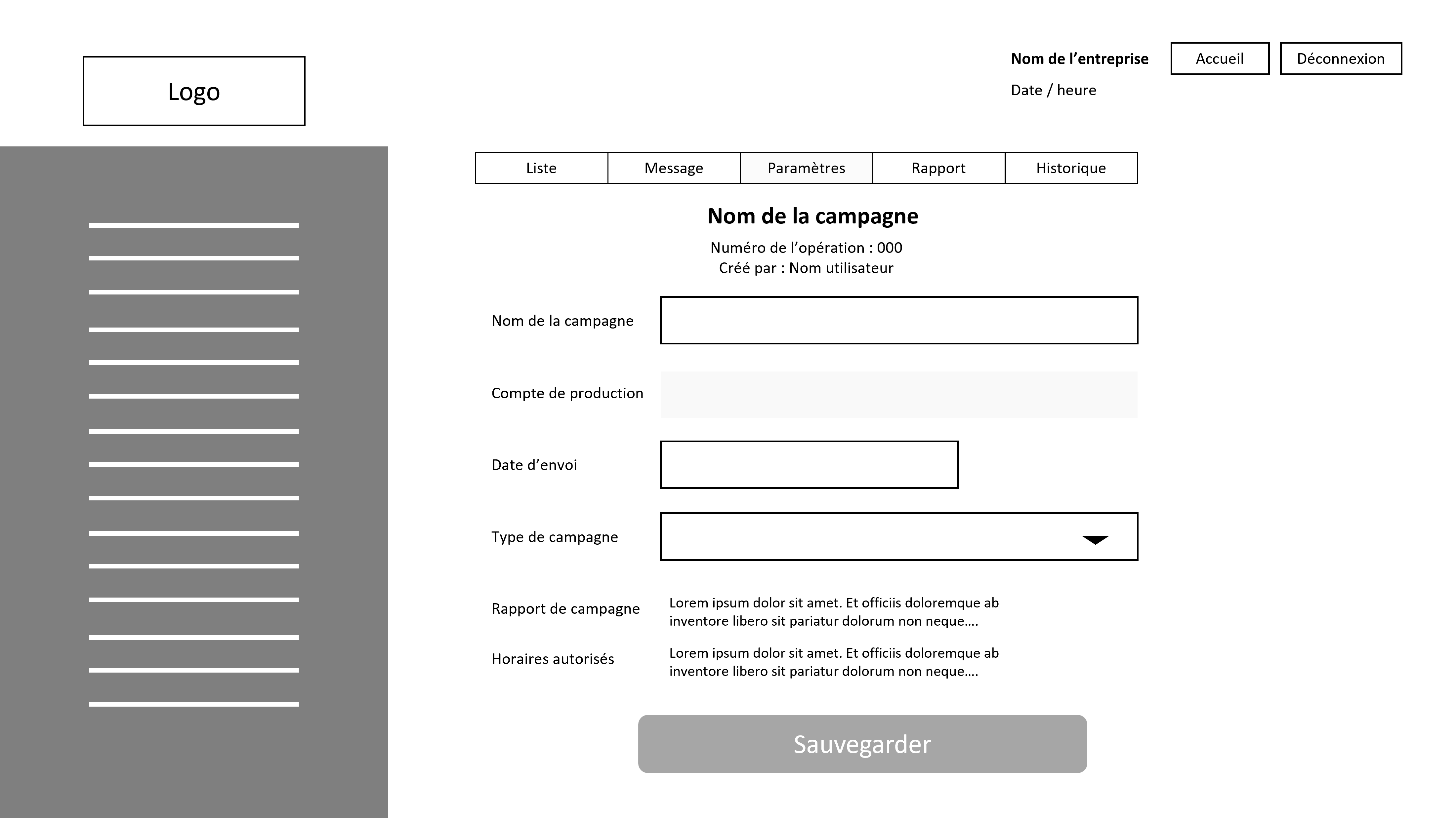
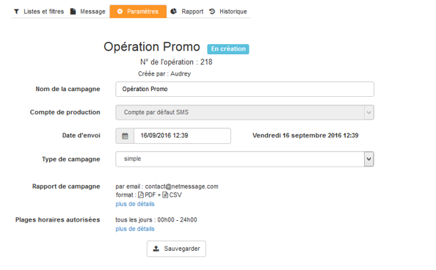
screen “campaign parameters”
screen ” broadcast report”
First screens of the 30 SMS plateform
Screen “log in”
screen ” list of campaigns”
screen ” import / add a list of recipient numbers”
screen ” testing the campaign”
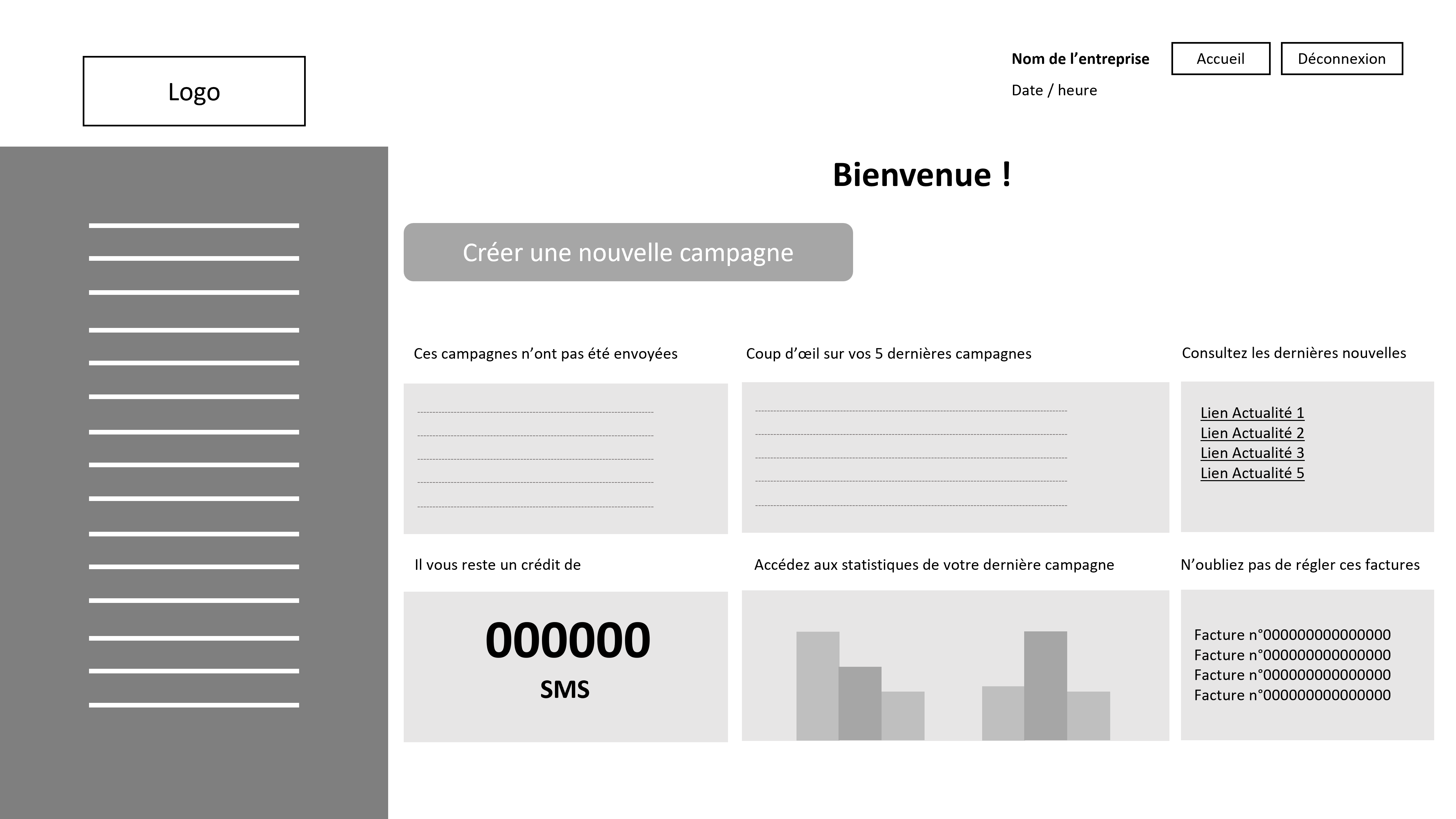
Screen “dashboard”
screen “creating a new sms campaign”
screen ” writing the SMS “
screen “campaign parameters”
screen ” broadcast report”
Main evolutions
Dashboard :
User can
create a new campaign
access campaigns that have not yet been launched
access the statistics of the last campaign
view the broadcast status of the 5 latest campaigns (in progress, finished, invoiced, etc.)
access the latest publications of the corporate blog site
access unpaid invoices
Campaign lists
User can
send / delete one or several campaigns
force the updating of the broadcast data of one or more campaigns
get a preview of the message to send (sender + content)
view the overall statistics of a broadcast campaign
Verbatim
The term “operation” becomes “campaign”
The call to action “Add” becomes “Create a new campaign”
The term “Date of injection” becomes “Date of send”
Campaign testing
The user can :
import a list of test recipient numbers
use a test list already imported on the interface (history)
easily manually enter/remove test recipient numbers
Verbatim
The “Test” call to action becomes “Send a test”
Side main menu
Verbatim
“Operations” becomes “Campaigns”
“List management” becomes “Contact management”
“Blacklist” becomes “List of unsubscribers”
Conclusion
Following the takeover of the company and the change of Management, the software overhaul project was definitively abandoned in 2020 after a hiatus for almost 3 years. Only a few customers who have been migrated to the 3.0 interface and whose traffic was exclusively reserved for SMS campaigns have continued to communicate until then.
In the end, the 3rd version of this messaging tool was supposed to give the promise of a more modern, accessible, efficient and generally more pleasant experience for the company’s customers.
If the project had been able to continue, I would have much more included the users in the research process. Initially, the software was built by developers. This means, for example, that the verbatim is still today too “technical” and not sufficiently vulgarized to be easily understood by all. Indeed, many terms are difficult to understand without prior explanation during the training of customers in the use of the CPaaS but also of employees in charge of customer campaigns.
If it had been possible, I would also have liked to work more on simplifying the campaign creation process and developing a more conversational interface to improve user comfort. I also think that the implementation of an interactive onboarding tutorial would have made it possible to reduce user friction, calls / emails to the customer support and therefore improve customer satisfaction.
A lot of work had been done on the redesign of the user interface. It was prettier to look at… but the backend technology remained relatively complex, causing negative interactions, and therefore a poor user experience.
Arielle NTSONDE | UX Designer & Product Writer | Paris (FR) or Remote EMEA