The Cottage Hotel
Design an online hotel booking experience, that is simple and accessible
I conducted this project to validate my professional UX Design diploma with the UX Design Institute based in Dublin, Ireland.

The client is a new hotel : The Cottage. They’re looking to create an online booking experience that is simple, accessible and based on a deep understanding of their target users.
Booking a hotel room online should be a simple and enjoyable process but, sometimes, it can feel complex.
Solution
Design and build a clickable prototype for the client that can be tested with users.
- User research
- Analysis and ideation
- Interaction Design
- Wireframing
- Prototyping
8 months
Part time
- Volunteer students from the UX Design Institute (remote)
- Family, friends (face to face + remote)
Process
To end up with a product that fits with the clients expectations and their users, I had to first understand how similar hotel booking plateforms work and espacially how users interact with them. I identified many pain points but also axes of improvement.
I put structure on the large volume of data that I gathered during the research phase and defined the high-level steps in the hotel booking journey. This led me to design effective flows and interactions that I could later use to develop the prototype.
Identify the problem
How do direct competitors solve the problem ?
Step 01
Competitive Benchmark
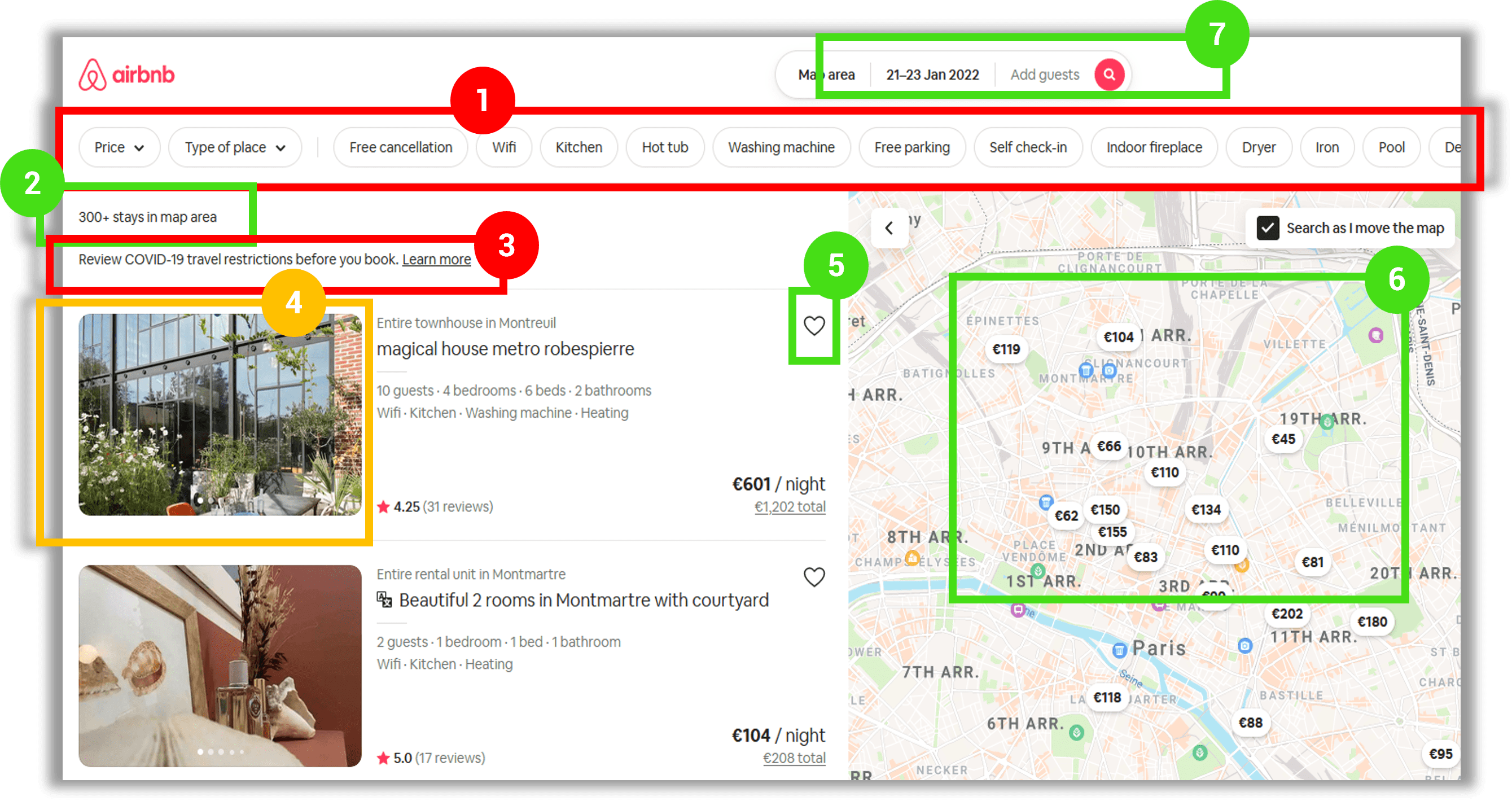
It is a very useful research technique to analyze what direct competition does right, so you can learn from what they are doing wrong. I ran a competitive benchmark that helped me to understand what the main conventions are in this business area and highlight best pratices that I could emulate.
In the research, I reviewed 4 online booking websites :
- AirBnB and Agoda (aggregators used to compare hotel offers)
- Marina Bay Sands and Secret de Paris (direct hotel booking websites)
These digital products represent different ways of booking a hotel online and 2 different navigation systems. Analyzing them enabled me to have a complete overview of the market offer and how visitors can interact with each.
I captured screens that reflect the process of booking a hotel : landing on the homepage, searching and selecting a hotel or a room, entering the room details and paying.
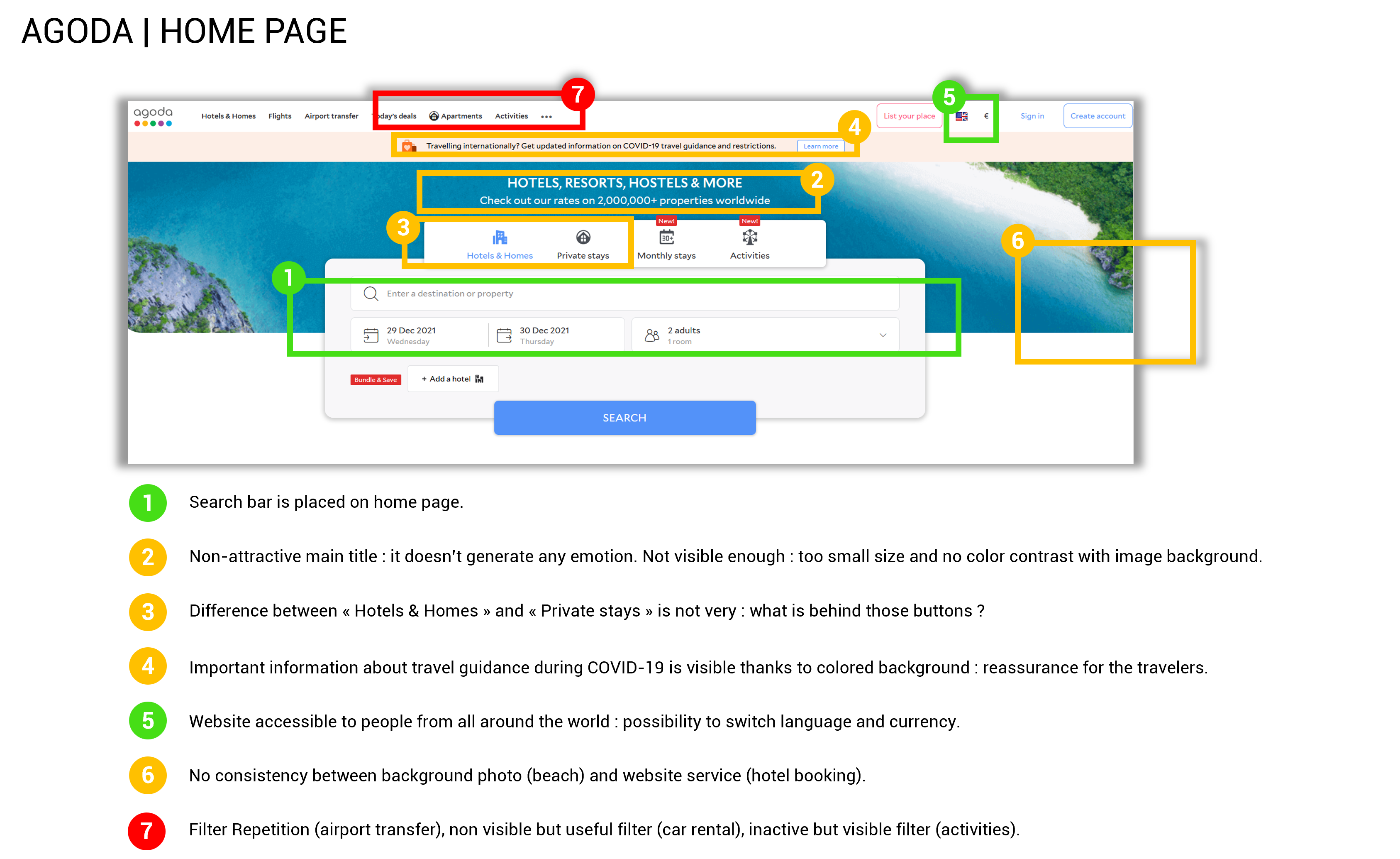
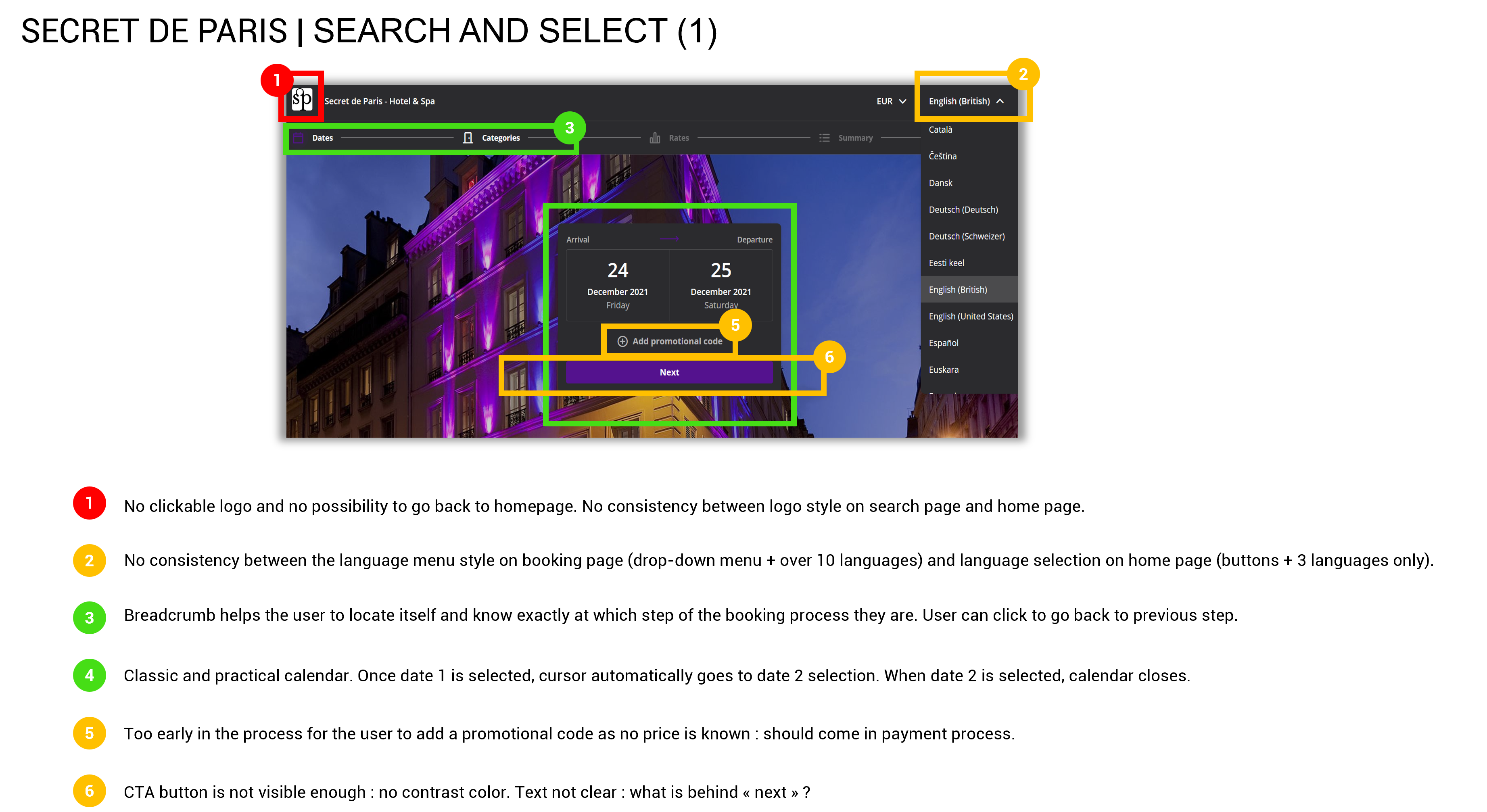
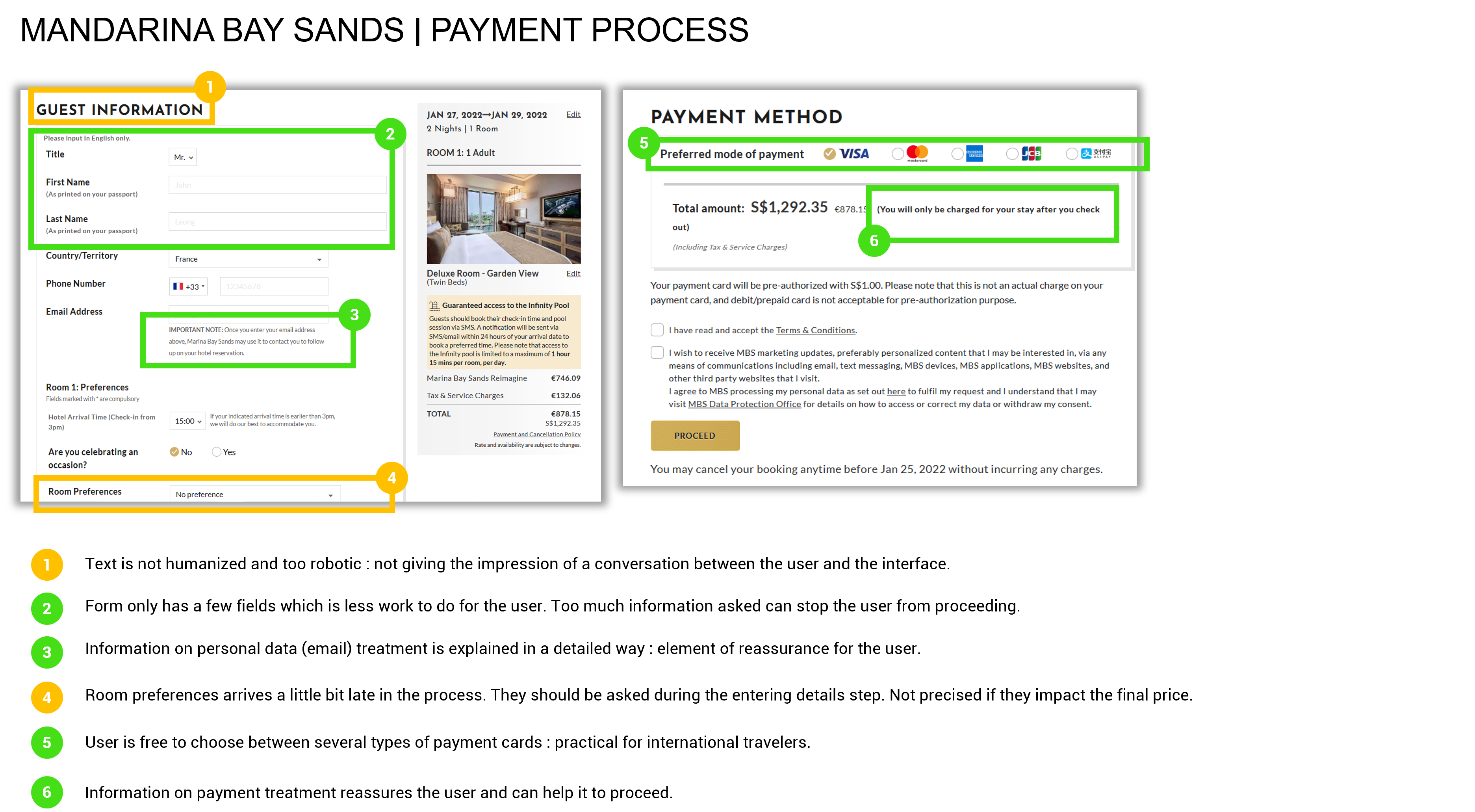
Key findings
- Booking CTA and search bar are placed in the homepage
- User can edit travel preferences at all steps
- Short text description help the user throughout the process
- The progression bar enables the user to locate on the process
- Easy going back actions with progression bar or arrows
- User can look at many pictures of the room
- User is provided with several payment options
Understanding the goals and expectations of the potential users
Step 02
Online survey
To collect user data I used a triangular approach : online survey, usability test sessions and note-taking techniques. The goal of this research phase was to learn more about the goals of people that use hotel booking websites and create a bank of insights that will be used later in the project :
- What are they trying to do ?
- Is there anything preventing them from doing it ?
- What other features would they like to see ?
Completion of the survey :
- Tool : Survey Monkey | Go to the survey
- Number of questions : 10 (4 structured, 6 unstructured questions)
- Number of participants : 49
Key findings
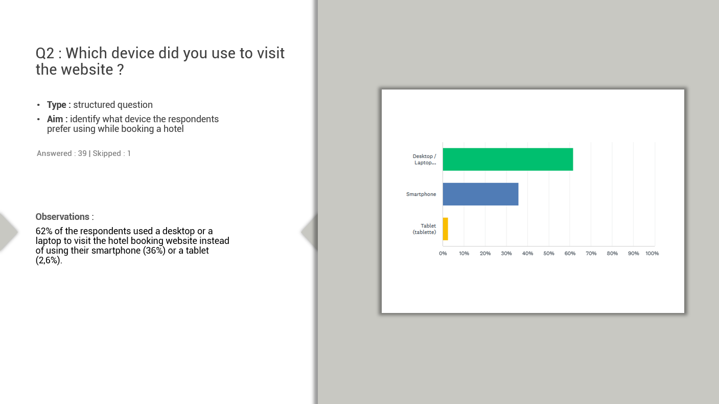
- Approx 62% of the respondents prefer using a desktop / laptop device rather than a phone to book a hotel stay
- 80% prefer using an online aggregator because they like to compare prices
- 40% visit hotel booking websites because they want to make a reservation. Others visit them to compare prices (31%), to check availability and prices (10%), to get more information like pictures, facilities and services on a hotel (5%)
- 85% of the respondents manage to achieve their goal and find the needed information
- Possibility to compare prices, compare hotels / room and check user ratings are the top features users appreciate on booking websites

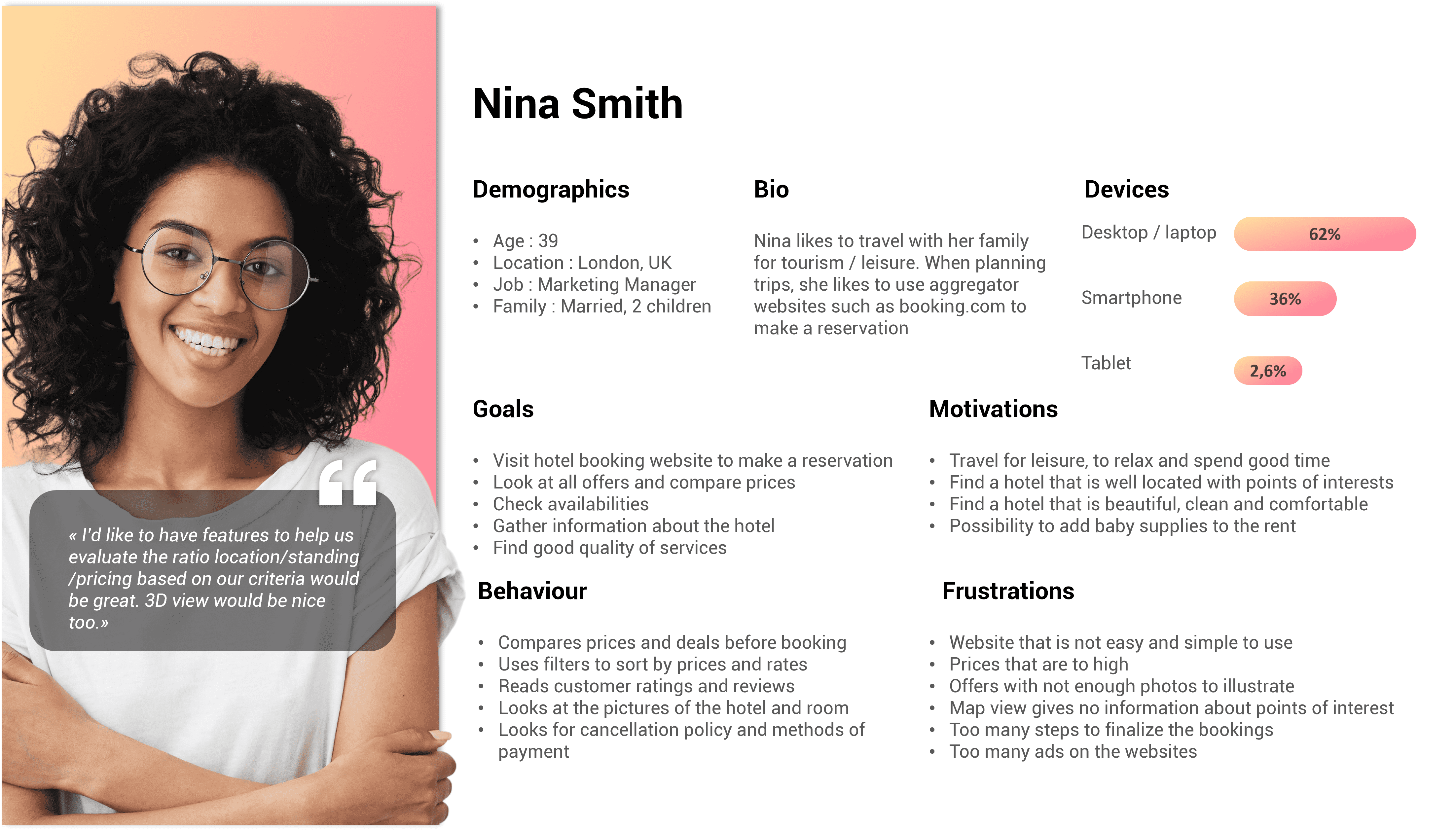
With the data collected via the online survey, I was able to conceptualize the portrait of a user persona.
- Nina is 39 and lives in London. Married with 2 young children, she enjoys traveling as part of her leisure time to spend time with her family or friends. To help her book a room in one hotel rather than another, she likes to be able to compare prices, look at photos and descriptions of rooms with detailed services. Customer reviews are also a decision-making aid.
- Nina appreciates search filters on a website because she hates having to scroll down a page indefinitely to get all the information.
- With young children, she would like to be able to easily rent childcare equipment so that she does not have to bring her own or share the parental bed. Unfortunately, it happens that Nina gives up a reservation because the prices are too high, because there are not enough photos of the establishment, because the reservation process is too long or simply because the site web is not working properly.
Step 04
Usability testing
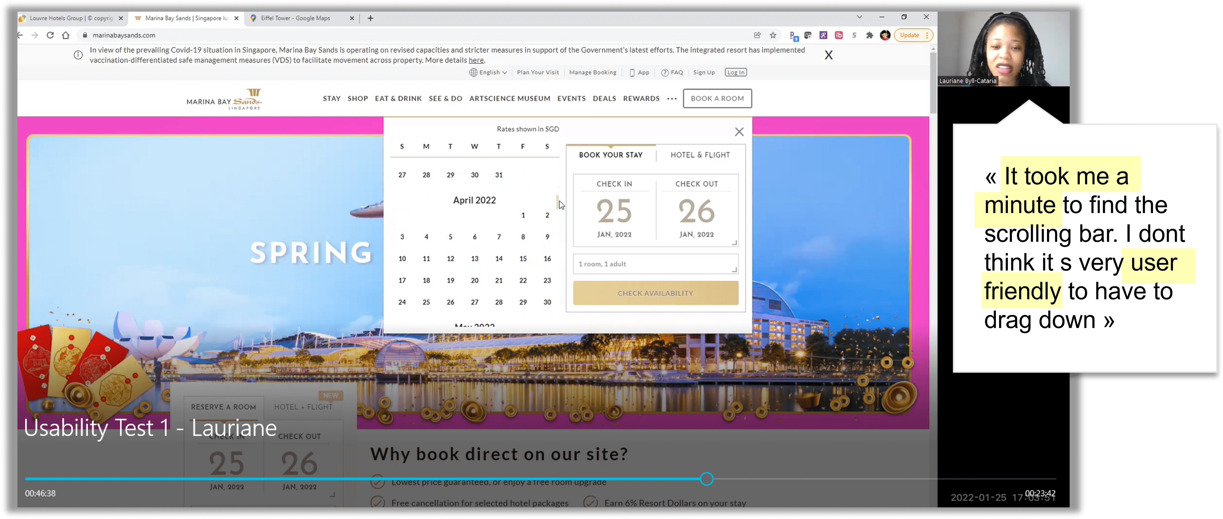
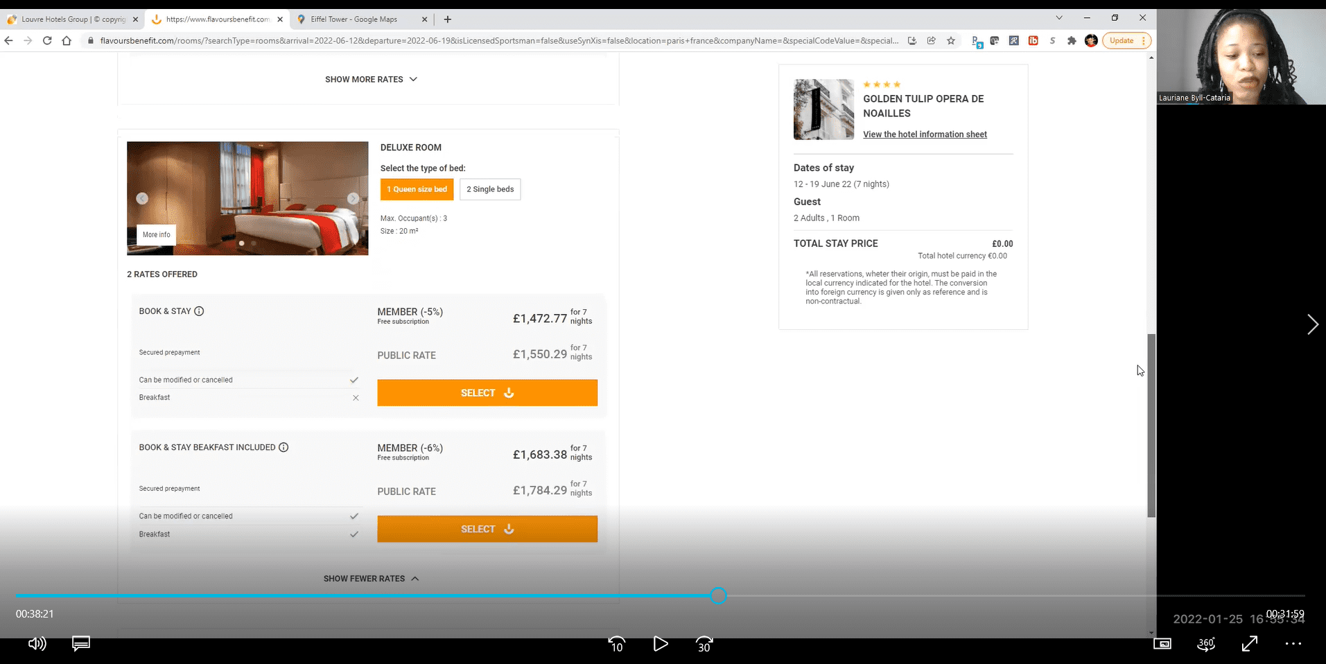
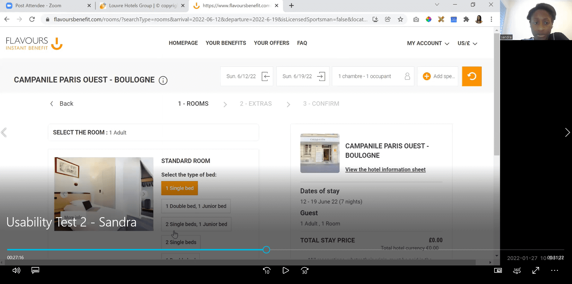
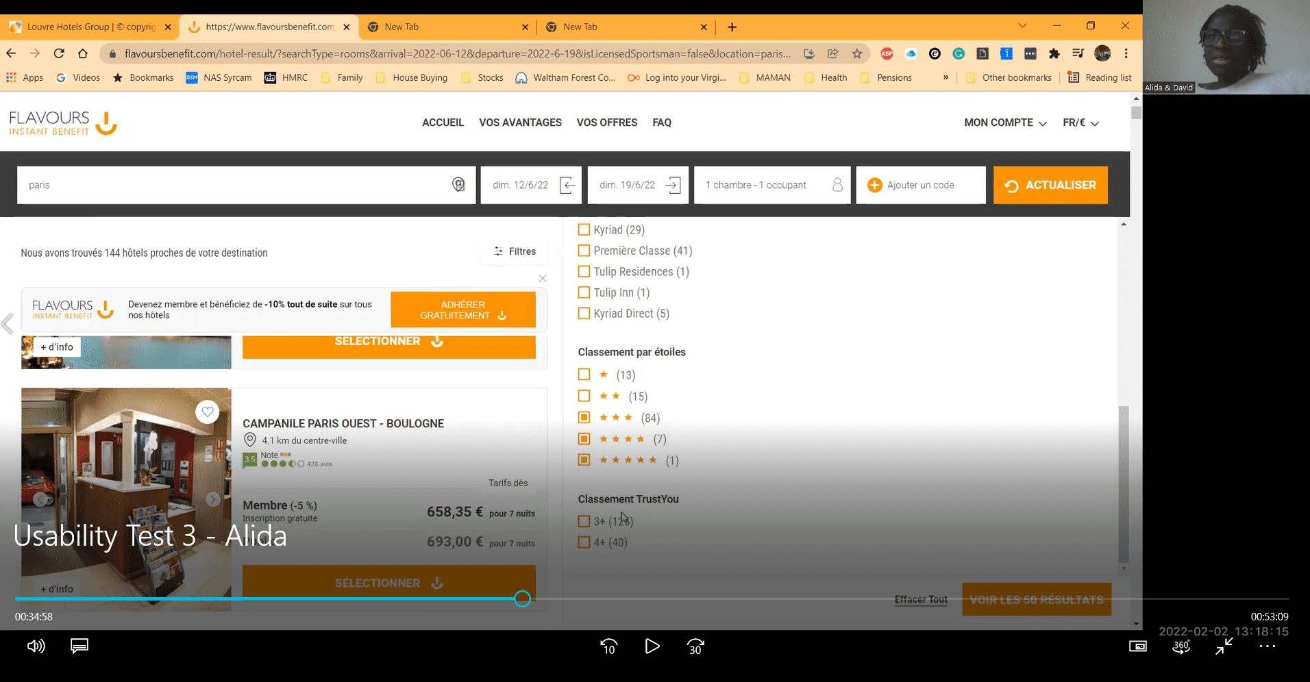
After collecting those insights from the survey, I conducted 3 usability test sessions using the Zoom application. They enabled me to observe how the users interact with similar products.
As I took the role of both moderator and note-taker, I was able to focus on and retranscript the users’ behaviours, picture positive interactions and pain points for each participants.
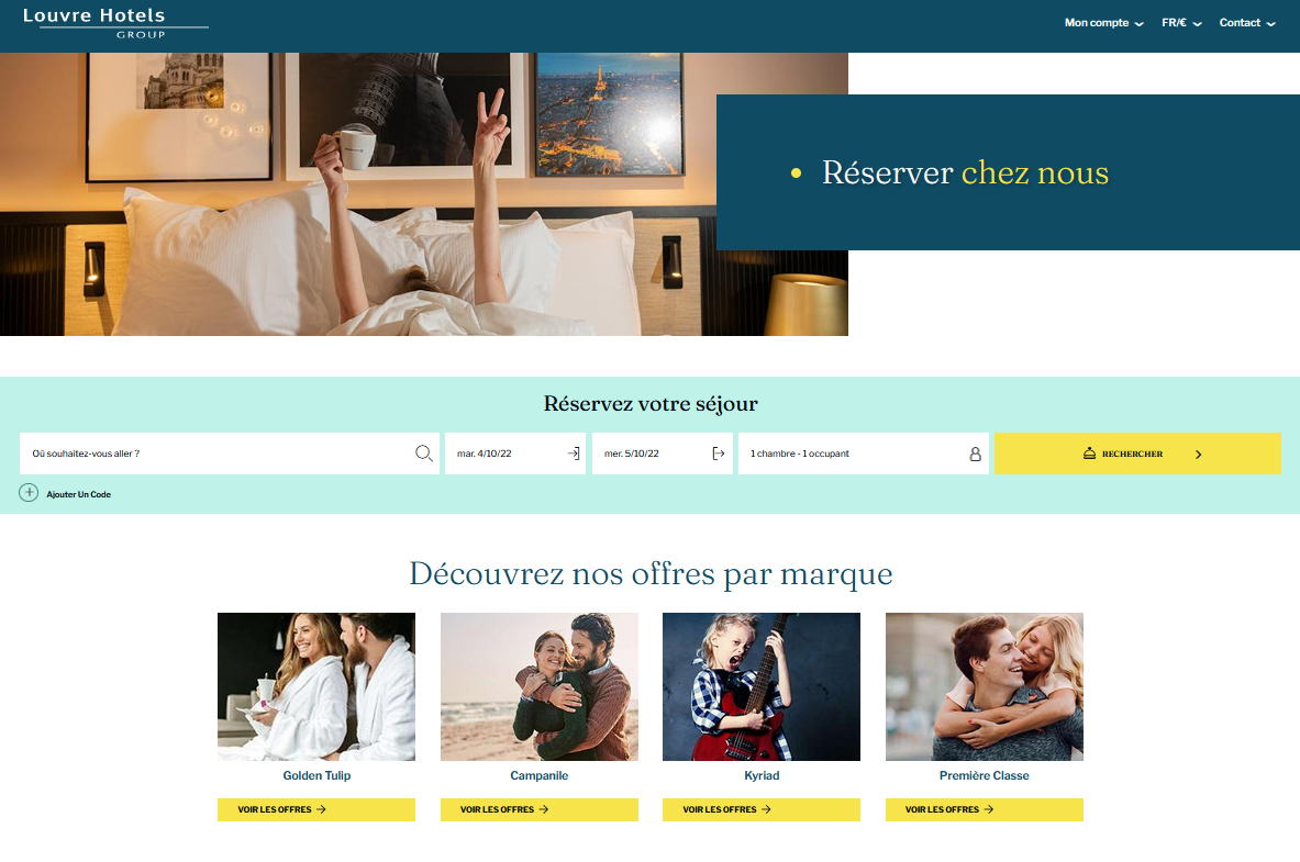
I decided to have them testing 2 websites : www.louvrehotels.com and www.marinabaysands.com that I had previously analyzed in the benchmark. All participants had sent me back a signed consent form to use the footage in this portfolio.
I prepared the sessions by visiting the websites myself so that I can write the scripts and make potential adjusments.
Louvre Hôtels
Scenario 1
For the purpose of the tests, users want to plan a holiday break in Paris with a partner for a week. They were asked to :
- Visit www.louvrehotels.com
- Book a hotel from June 12th to June 19th 2022, with breakfast included
- Look for a hotel to be located in the heart of Paris, close to the Eiffel Tower
- Look to make the payment on arrival rather than paying upfront, with the possibility to cancel the room if needed
Hôtel Marina Bay Sands
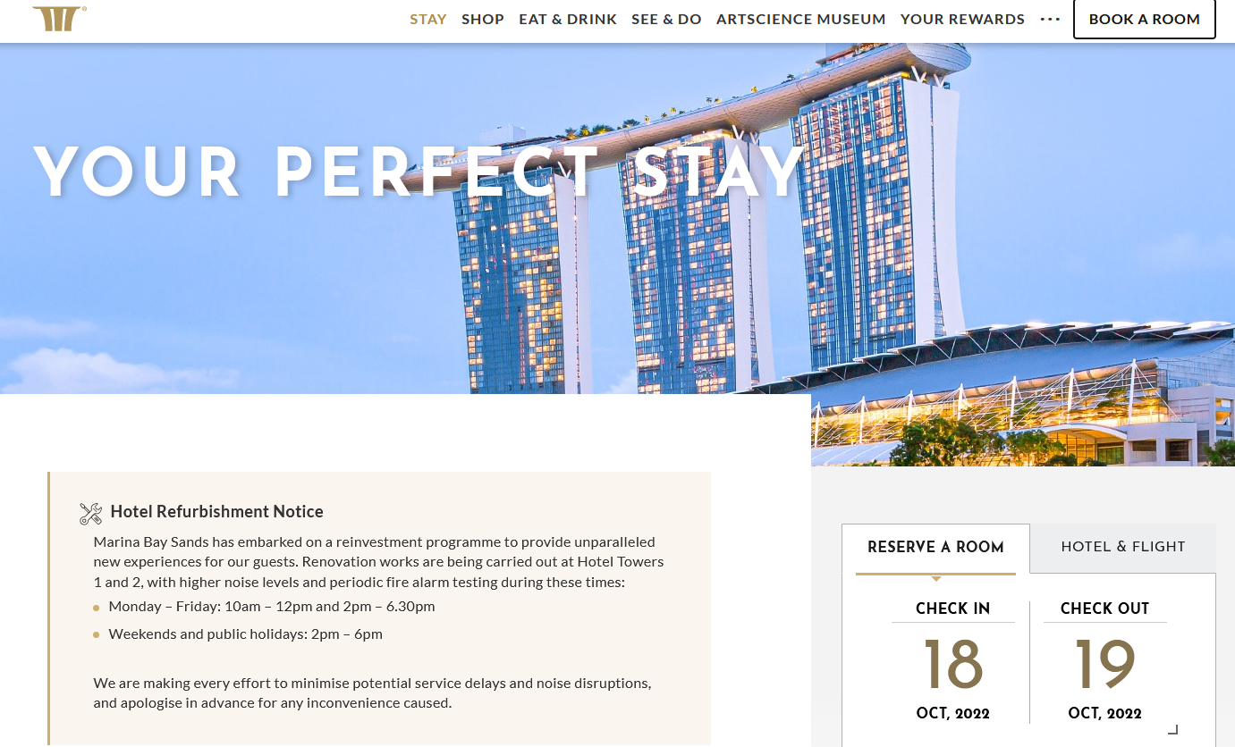
Scenario 2
For the purpose of the tests, users want to plan a long weekend away to Singapore with a friend. They were asked to :
- Visit www.marinabaysands.com
- Make a reservation on the 2nd or 3rd weekend in April 2022, Friday to Monday
- Book a twin room preferably with breakfast included and view on the garden
N°1 Session
Lauriane, 37 years-old
Houston, Texas – USA
Date : 01/25/2022
Duration : 1h10
N°2 session
Sandra, 39 years-old
Gland, Switzerland
Date : 01/27/2022
Duration : 0h58
N°3 session
Alida, 37 years-old
London, UK
Date : 02/02/2022
Duration : 1h28
After running these usability tests I’ll will remember the complexity of guiding the user while avoiding to take part and letting them move the more freely possible through the process. Although I succeeded in making the users comfortable, I struggled to manage time and put structure on the interview so that it doesn’t last more than 45 mn to 1 hour.
Globally, the experience seemed to be more pleasant on website 2 (Marina Bay Sands) because of the sleek and minimalist design. The main difficulty for the users was to find out how to add breakfast to the reservation. They also were confused with the various offers and it wasn’t always easy to understand. In addition, they sometimes had to go back and check that everyting was going well with the reservation. This may reveals a lack of recall statement in the process.
Articulate the problem
Making sense of a large volume raw data and understand the user journey
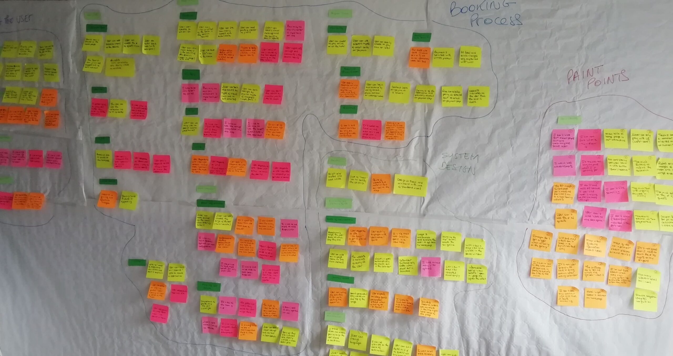
Now that the problem is identified, I have to review all data collected from the research phase and organise them by creating an Affinity Diagram. The goal of this analysis technique is to identify patterns ands trends influencing the user’s experience when interacting with hotel booking apps.
I began to wrote down on post-its relevant findings, behaviour and emotions regarding the booking process. I placed them on a wall and began to group related notes together.
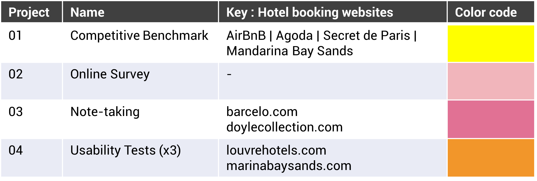
Once I had done that, I sorted the notes by colors : 1 color = 1 source of research.
After that, I started to group the notes in themes that made sense to me and appear to focus on a similar subject.
I ended up identifying 12 groups to start organizing. I named them and placed a light green sticky-note above each section.
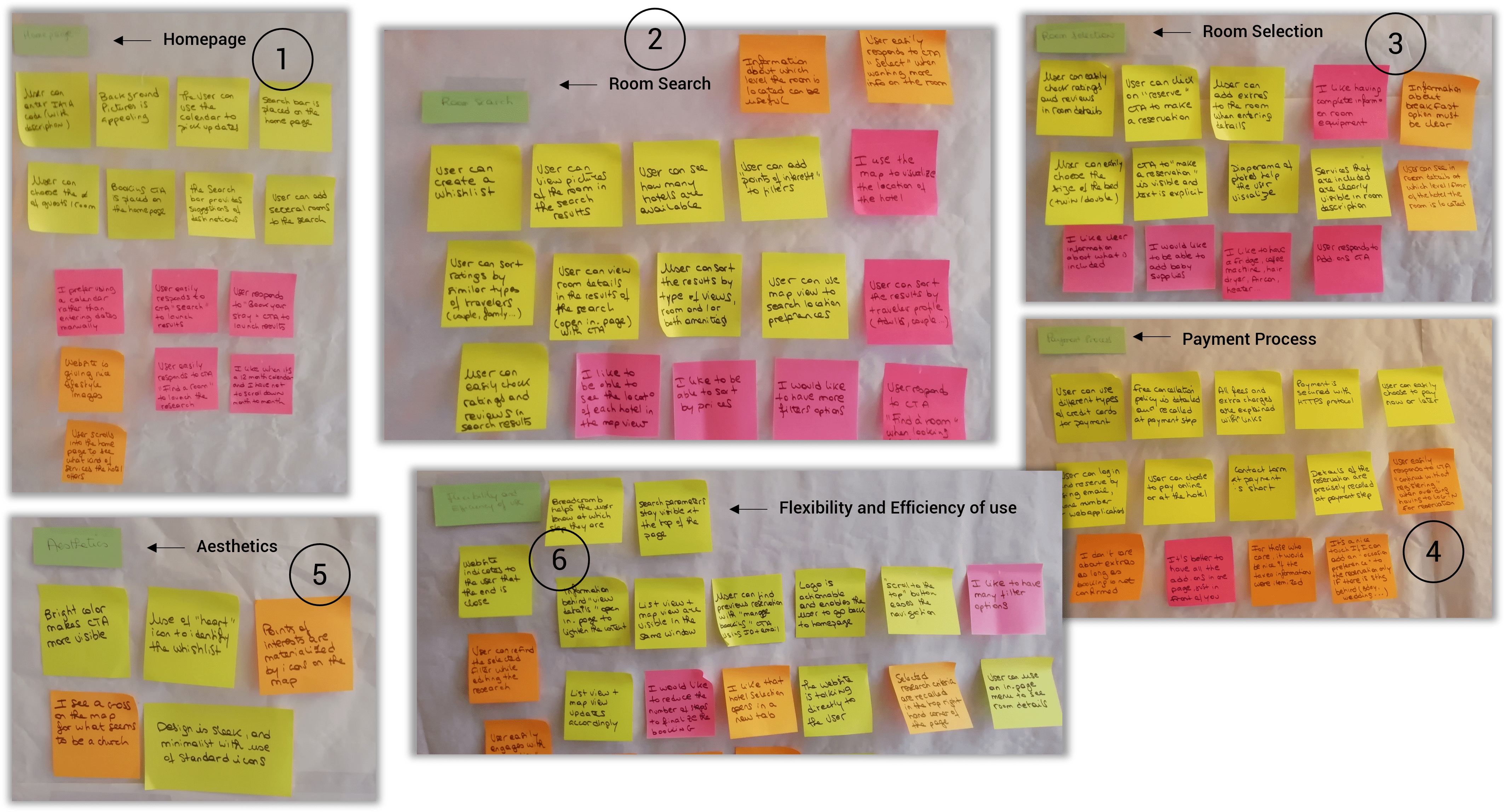
Once I had the groups, I put aside the doublons I had in the sticky-notes to lighten my wall of research. Then I pursued on the analysis and manage to subdivise the groups further.
I named those subgroups and placed a dark green sticky-note above each undersection to separate them from each other.
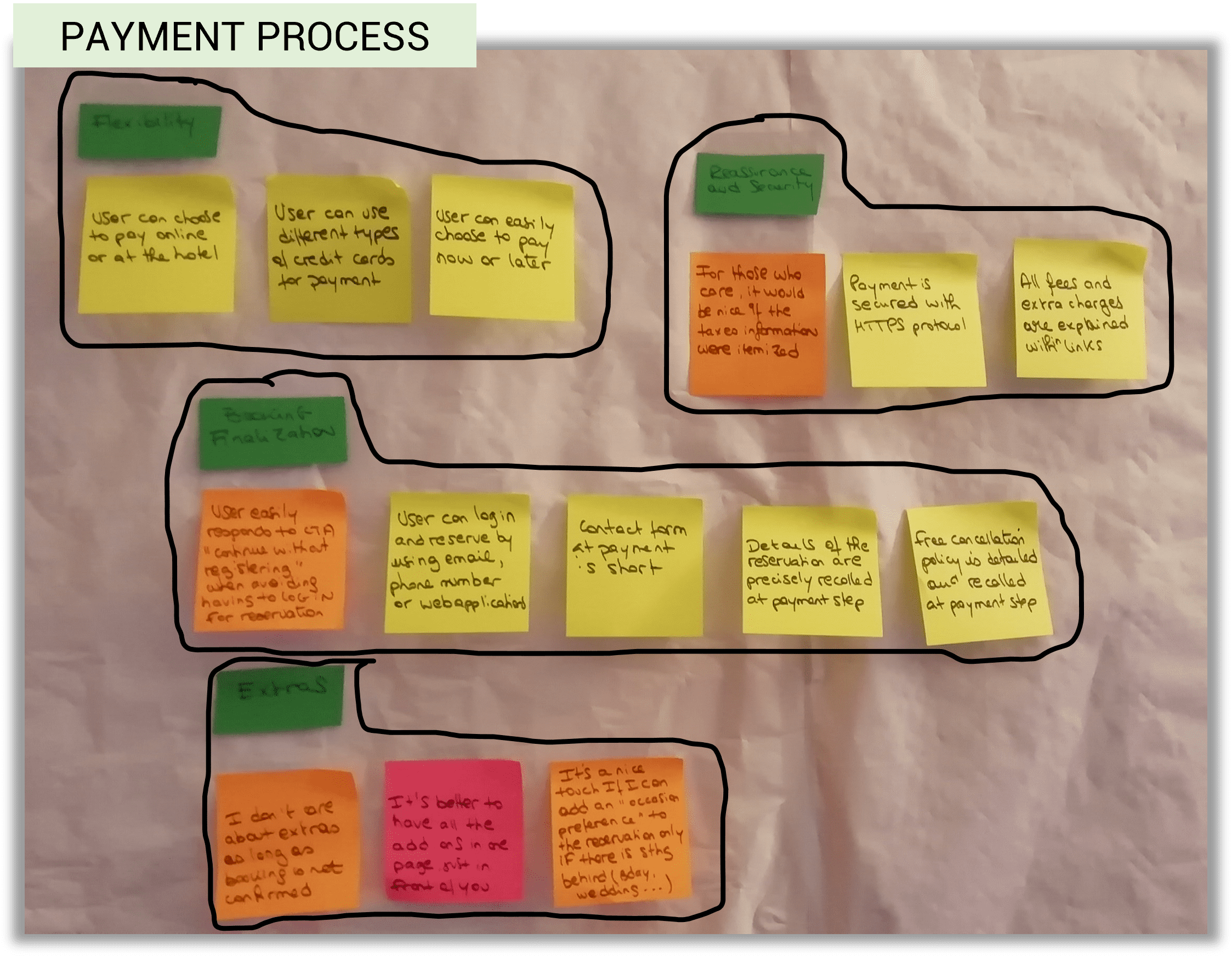
At the end of this task, I articulated the 12 themes into 4 main groups :
- Booking process
- System design (includes UI practices)
- Helping the user (includes UX writing)
- Pain points
Key findings
- Although pain points are not supposed to be designed, they will need to be solutioned afterwards and appear as a recall of what not to do.
- The final steps were to sequence the subdivisions into a chronological and intuitive user flow.
- I did not integrate the groups “system design” and “helping the user” into the sequencing because they are apart from the user journey. They represent insights to keep in mind when the time will be to conceive an intuitive and adapted product.

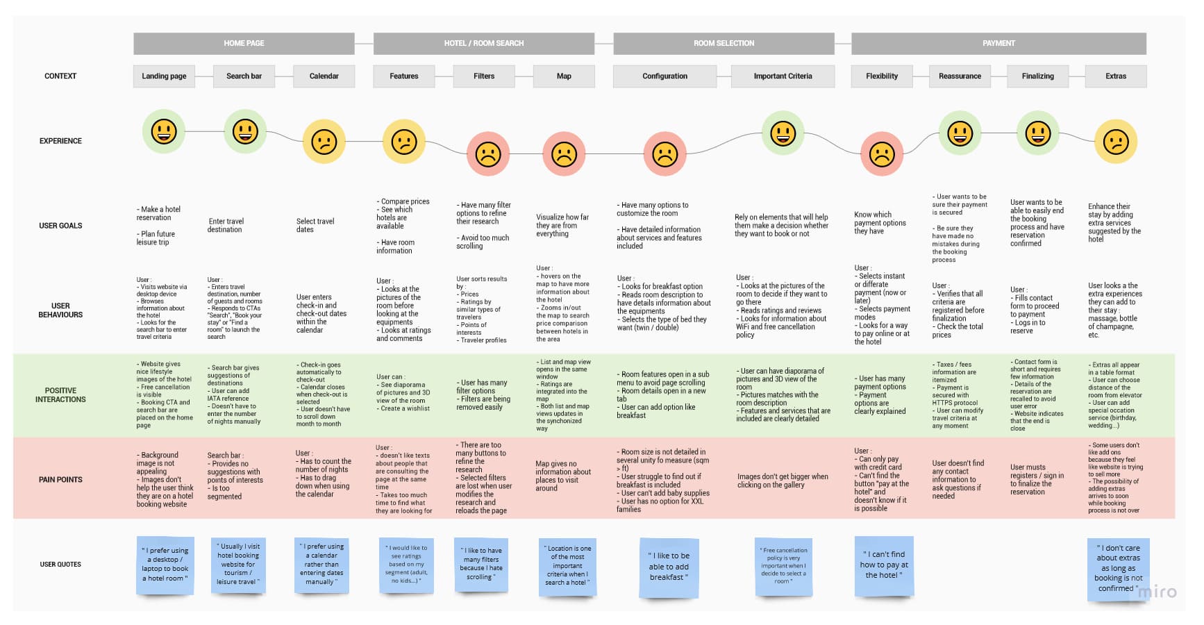
Based on the groupings from the affinity diagram, I conceptualized a user journey map that define the high-level steps of the journey. I made sure to capture the reality that some users may visit a website many times before completing the task.
Tool : Miro
For each steps, I documented the goals of the user, positive interactions or pain points, and whether there were any behaviors the website or app was not facilitating.
Where it was relevant, I added some direct quotes from the users to help bring the journey map to life.
Key findings
- Users are used to looking at the pictures to make a decision
- They like to have several filter options so that they can affinate their research and save time
- Users would like to be provided with point of interests suggestions while using the map view
- Users like to have several payment options
- Users like to have easy cancellation options

At this step of the process, I’m starting to design the website. The overall objective is to fix the issues I have uncovered during the research phase, which are highlighted in the affinity diagram and customer journey map.
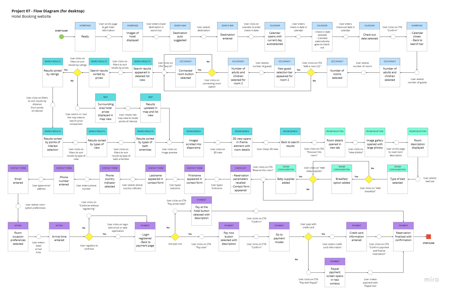
Since the data revealed that people prefer using a desktop / laptop device to book a hotel stay, I decided to design a desktop version of the website. Next step was to define a high-level flow for the website and lay the groundwork for the next design tasks.
First, I sketch out the user flow from the homepage to the payment screen on a piece of paper.
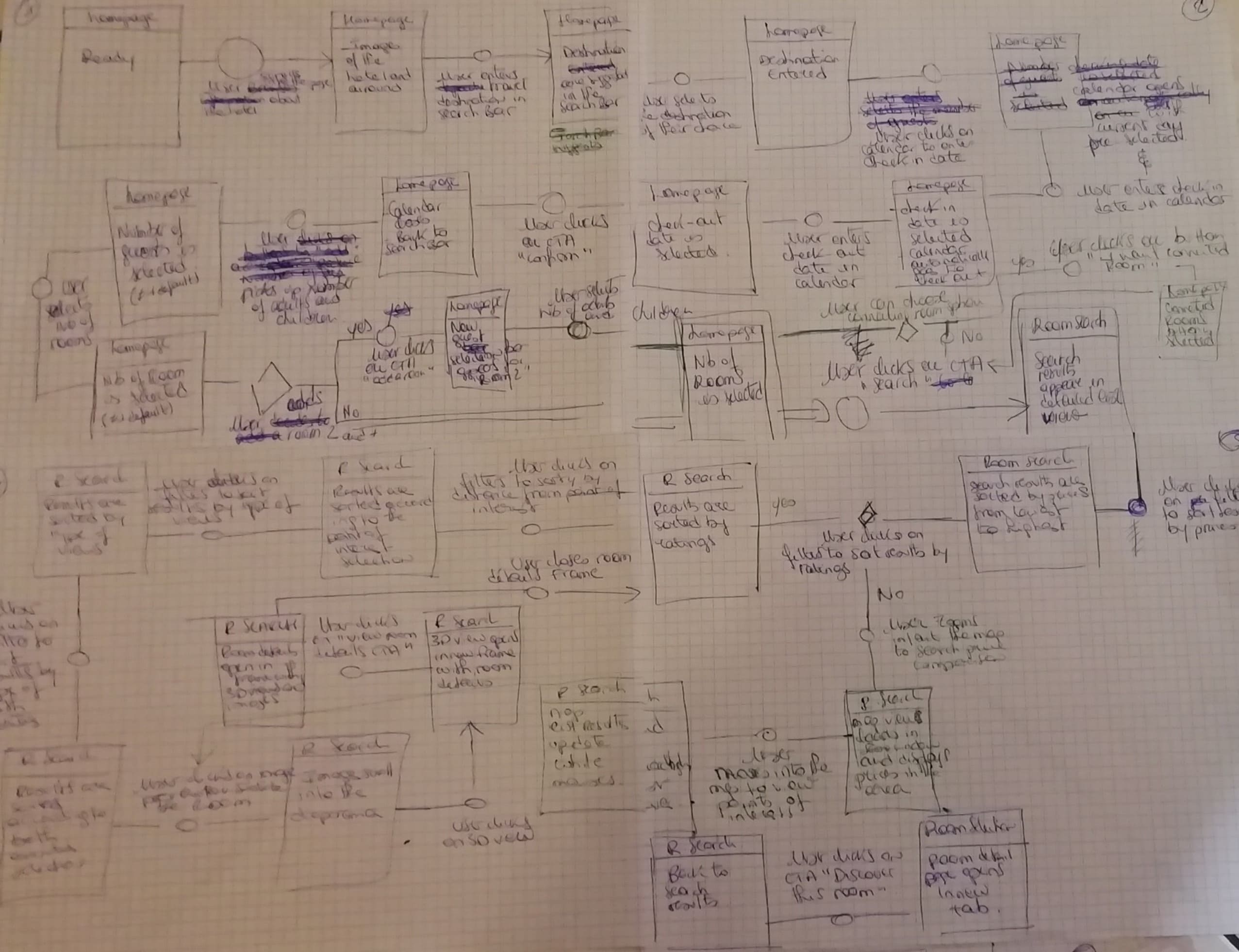
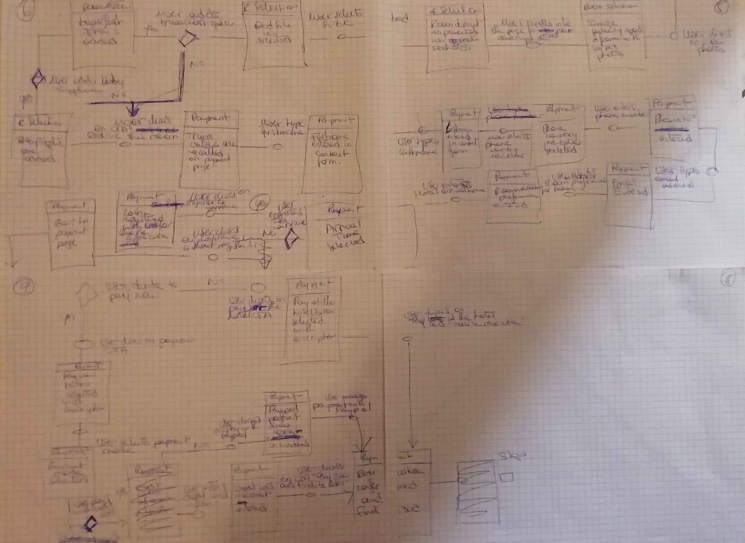
Each screen or state was represented by a box. In this sketching each interaction is represented by a circle and decisions are represented by a lozenge.
Then I built the mapping into Miro.
Interaction Design | Low fidelity Prototype
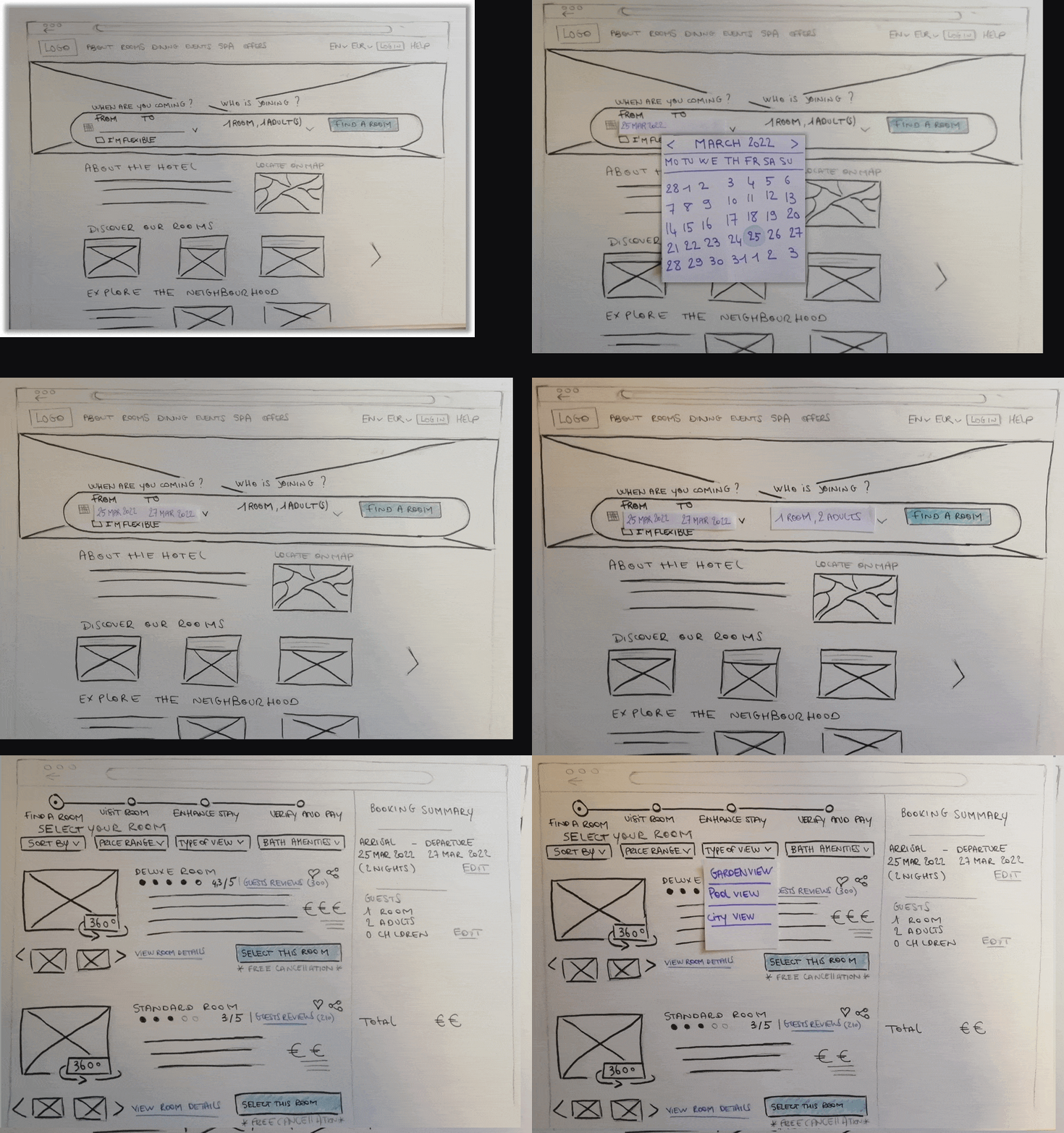
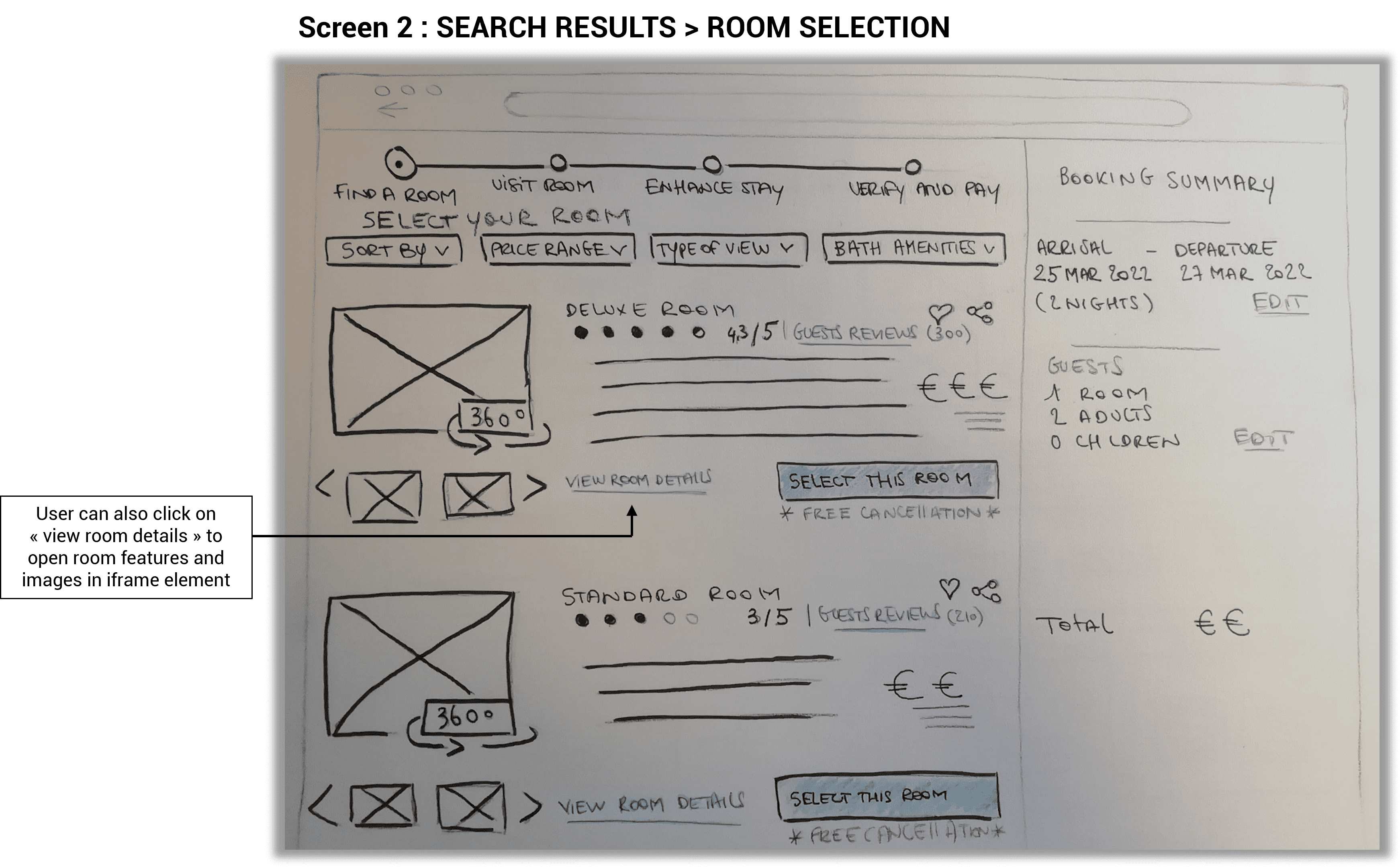
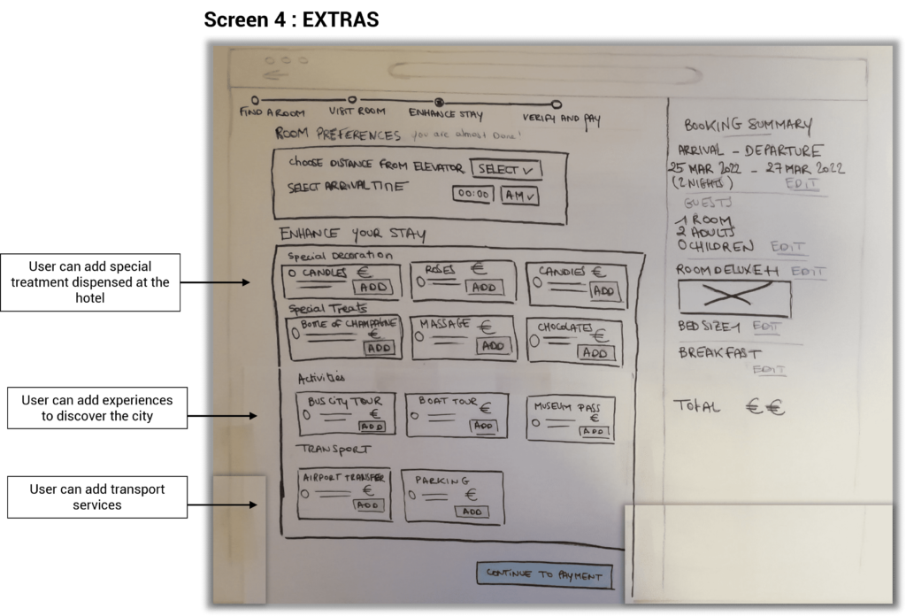
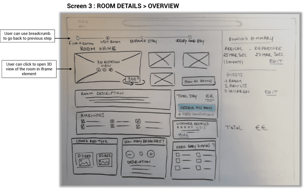
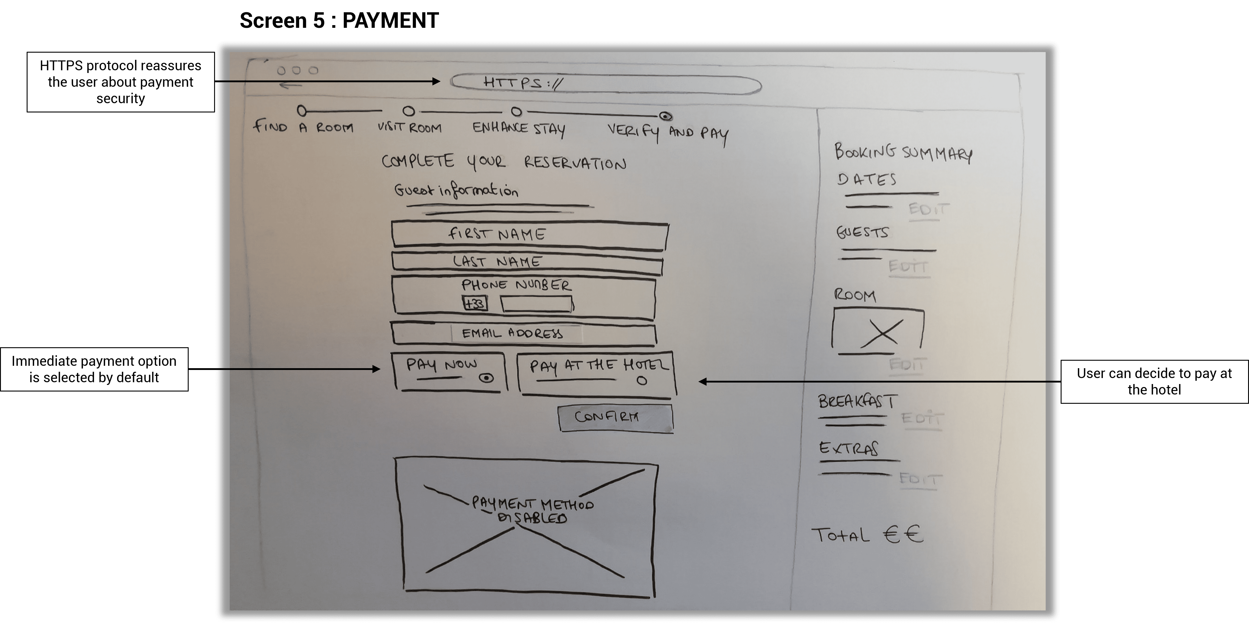
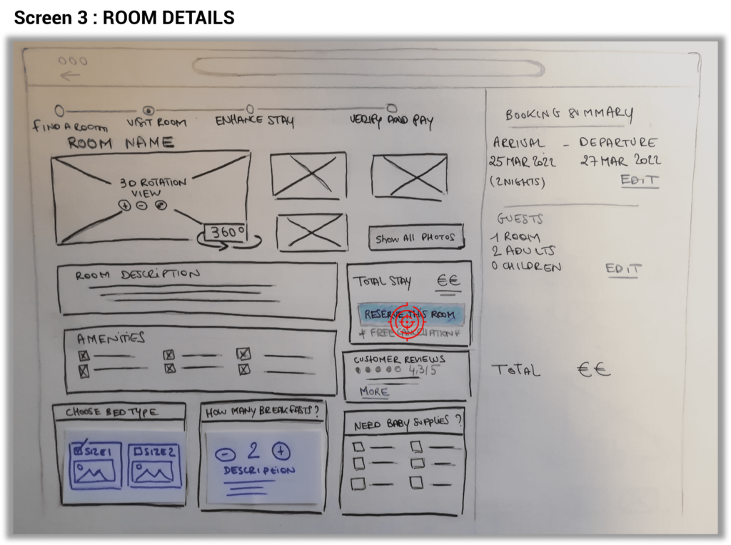
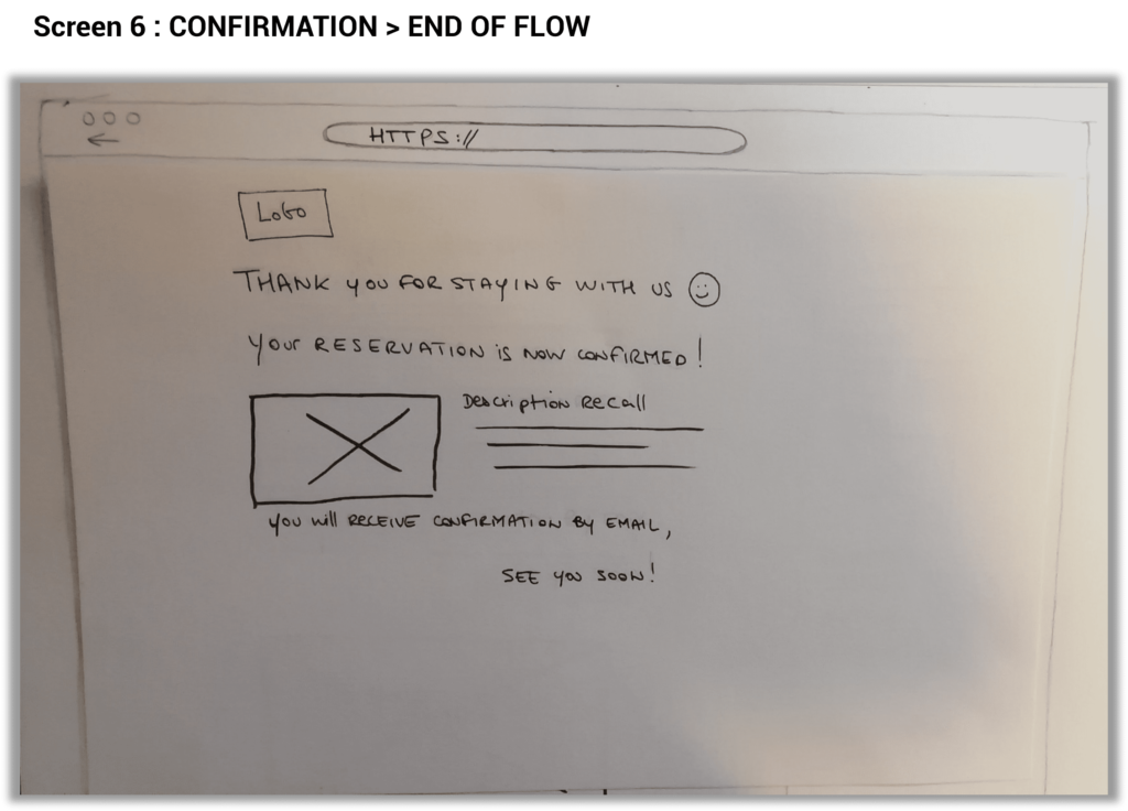
At this step, the objective was to address all the issues / user goals identified in the research and analysis phases. Built on the flow diagram, I sketched on drawing papers, the screens and screen states for users flowing through the desktop app.
First, I created a list of screens to design where Each screen represents a screen state.
Using a pen with paper sheets offers the possibility to be quick and easily iterate.
When it was possible, I used hover cards (calendar, filter, pictures…) to place on each screen. This was a fun way to go faster and avoid having to redraw all the screens everytime.
In the following steps, I will convert those sketches into a medium-fidelity prototype and wireframes.
Key findings
- While designing these sketches, I tried to respect as much as possible the stages of the user journey illustrated in the Flow Diagram.
- Since this is a website project for a specific hotel, it did not seem useful or coherent to me to integrate a map view with price comparison.
- Being provided with suggestions for activities and points of interest while searching for a hotel / room is a service that was often asked by the respondents of the survey and during the usability tests. This is why I chose to make them appear on the home page so that they are visible by the user as soon as they land on the website.
- The biggest challenge of this phase was to design a product that was both accessible and easily scalable while reducing the longevity and complexity of the process.

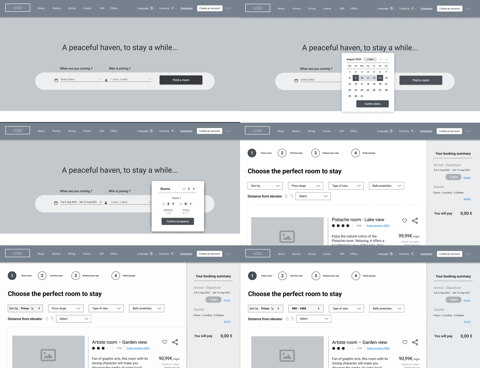
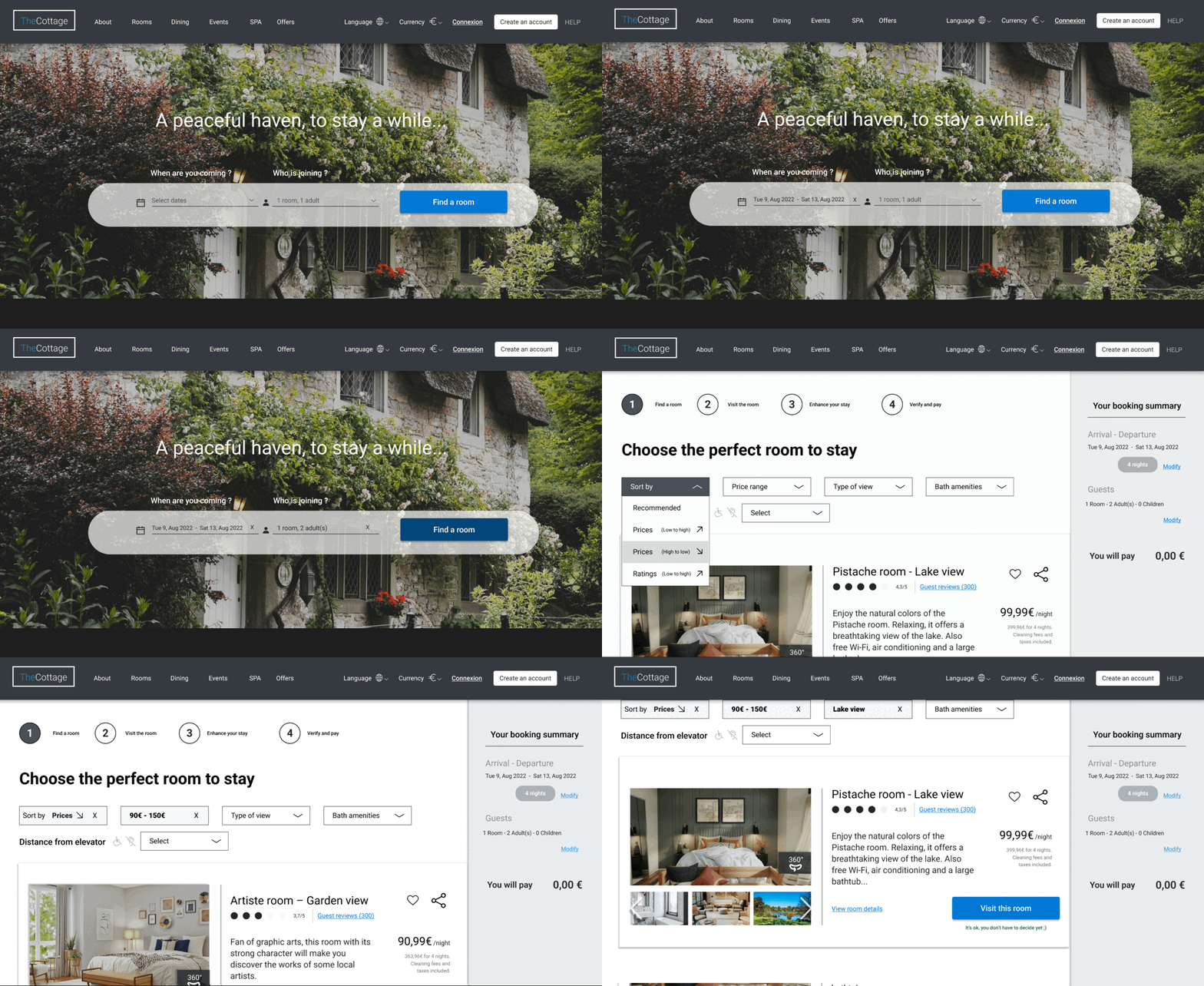
We are in the validation phase. For this stage of building the website prototype, I first built a medium-fidelity version by including as many interactions as possible. This first version already made it possible to test the high levels of the user flow, layouts and texts.
Tool: Figma. No design system or predefined component was used for the construction of this model.
For the purpose of the tests, users want to plan a holiday break in Paris with a partner for a week.
- Who : 2 guests
- Where : The Cottage hotel
- Why : travelling as a couple for leisure
- When : From August 9th to August 13 2022
- What : room with lake view, breakfast for 2 with extras (candles, chocolate, champagne), possibility to cancel, payment online.
- How much : 100€/night max. for the room
To validate this prototype, I had it tested by 3 users who had answered the online survey, during a face to face interview. During those sessions, I had to mention to the participants that they were not interacting with a real website but with a digital support that simulates interactions of a real hotel booking websites.
This usability test sessions enabled me to catch the global impressions, test the positive interactions and pain points.
Then, I could iterate and optimize the prototype.

Main iterations
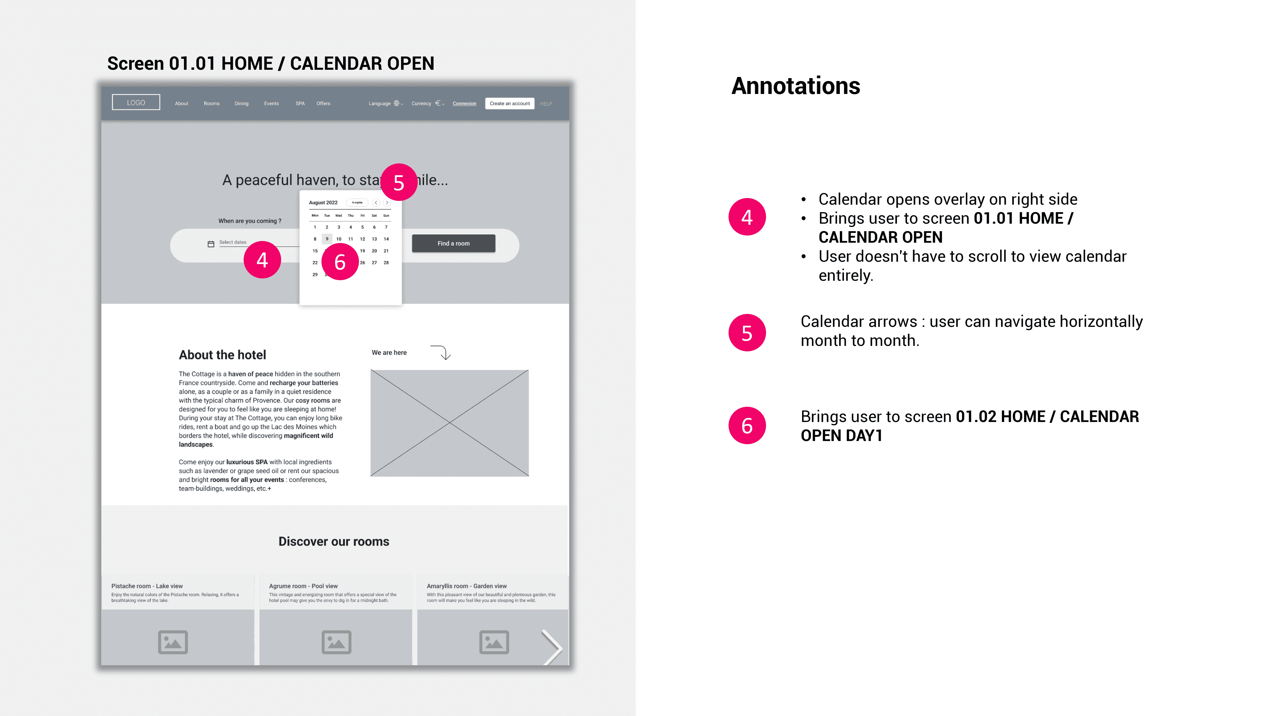
- Calendar opens ovelay at the right side of the search bar. User doesn’t have to scroll anymore
- Free cancellation policy text is placed under H1. Text is green in augmented font-size. It is more visible for the user
- Text « Select number of guests » is added under the subgroup title
- User knows they have to select the number of customers who will have breakfast
- Text « Select expériences and add them to reservation » is added under H1

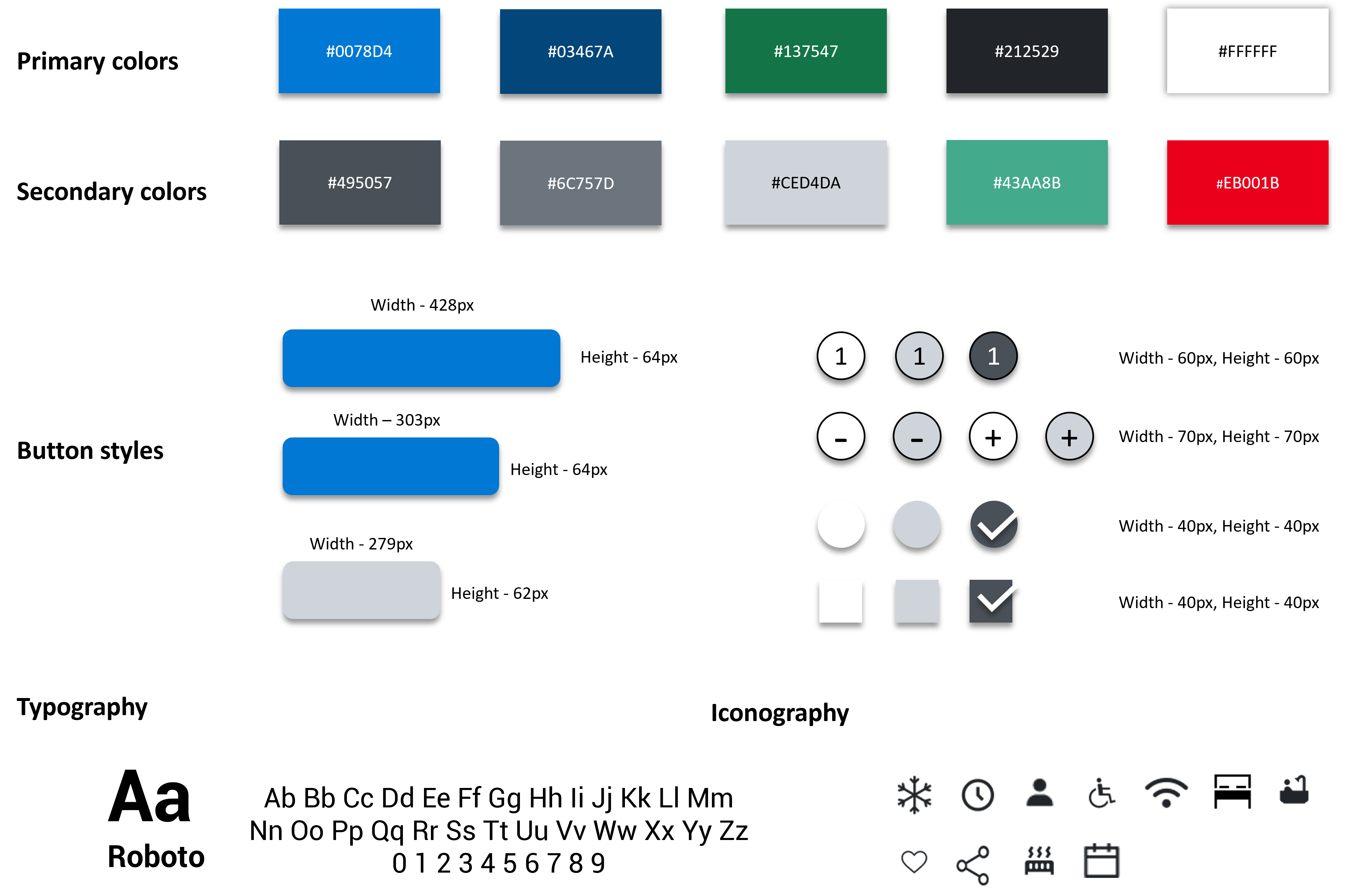
Without any imposed user interface guidelines, I chose to use blue as a primary color. Blue is a reassuring color that make people think about the sea and holidays. I preferred to keep green for the system feedback messages and red for error/alert messages.
Once the graphic charter was established, I integrated it into the model and was able to produce a High-Fidelity prototype including more contrasts and making sure to respect the hierarchy of information.
The design loop is finished. I’ve prototyped my designs and iterated them. I’ve also applied the final UI design.
At this point, the solution is ready for build. As part of this transition from design to build, it’s important to communicate clearly to the developers what exactly they need to build. That’s where handover documentation is critical.
I created a set of annotated wireframes that include information about the information hierarchy, the structure for the system and the way users interact with it. The documentation also defines :
- How the system behaves
- How it responds to actions taken by the users
- How it communicates results
- How it helps fulfill intentions
Conclusion
Booking a hotel room online should be a simple and pleasant process, but sometimes it can be complex. To create this prototype which could still be optimized, I based myself on the expression “Less is more”. I opted for a clean and minimalist design with a short user flow in 4 steps (search, visit, extras and payment), all part of an interface that guides the user at each stage of his journey.
To be effective and successfully penetrate the market, a product must be technically feasible, commercially profitable but also humanly desirable. Paradoxically, still too many websites and mobile applications are developed without taking into account the real user needs and the mental models to which users respond.
This result with over-featured solutions which 80% are useless and cost money to implement. This is the case on many similar platforms, which generates frustration among users and certainly impacts the conversion rates of the websites that are concerned.
On this project the many research techniques enabled me to identify the features that users really expect from a hotel booking website (filter options, attractive images, easy cancellation, etc.) and what they appreciate less (long process, absence of guidance, lack of services, etc.). I was then able to create an intuitive and immersive product that meets the expressed needs.
I also wanted to focus on user feedback by creating a real conversation between the user and the platform. Indeed, copy and content are still the poor parent in the user experience design. However, they are essential to help the user reach his goal as quickly as possible, while reducing pain points as much as possible.
